DESIGN SYSTEMS · 2020-2025
The systems behind five years of products.
The challenge
Multiple platforms grew over the years with their own conventions, creating visual inconsistencies and slowing development. The teams needed a shared visual language, flexible enough to respect the specifics of each platform.
MY ROLE
Built and maintained two design systems (mobile and web), defined the architecture that lets them share foundations while staying platform-specific, and documented patterns for the development teams.
tIMELINE
Continuous evolution from 2020 to 2025, with major version updates aligned to product roadmaps. The systems matured alongside the products that consume them.
1
Material as a base, not a ceiling
Started from Material Design 3 for development feasibility and engineering familiarity, then extended where identity and product needs required custom solutions.
2
One system per platform
Mobile and web have different needs: touch vs mouse, screen real estate, interaction patterns. Two libraries that share foundations but specialize where it matters.
3
Libraries are products too
Treated each library as a product with users (designers and developers). Documented decisions, versioned changes, stayed accountable for what the teams shipped.
01 • Foundations · Design tokens
The atomic decisions every screen inherits from: colors, typography, spacing, elevation, radius. The vocabulary every designer and developer speaks before reaching for any component.
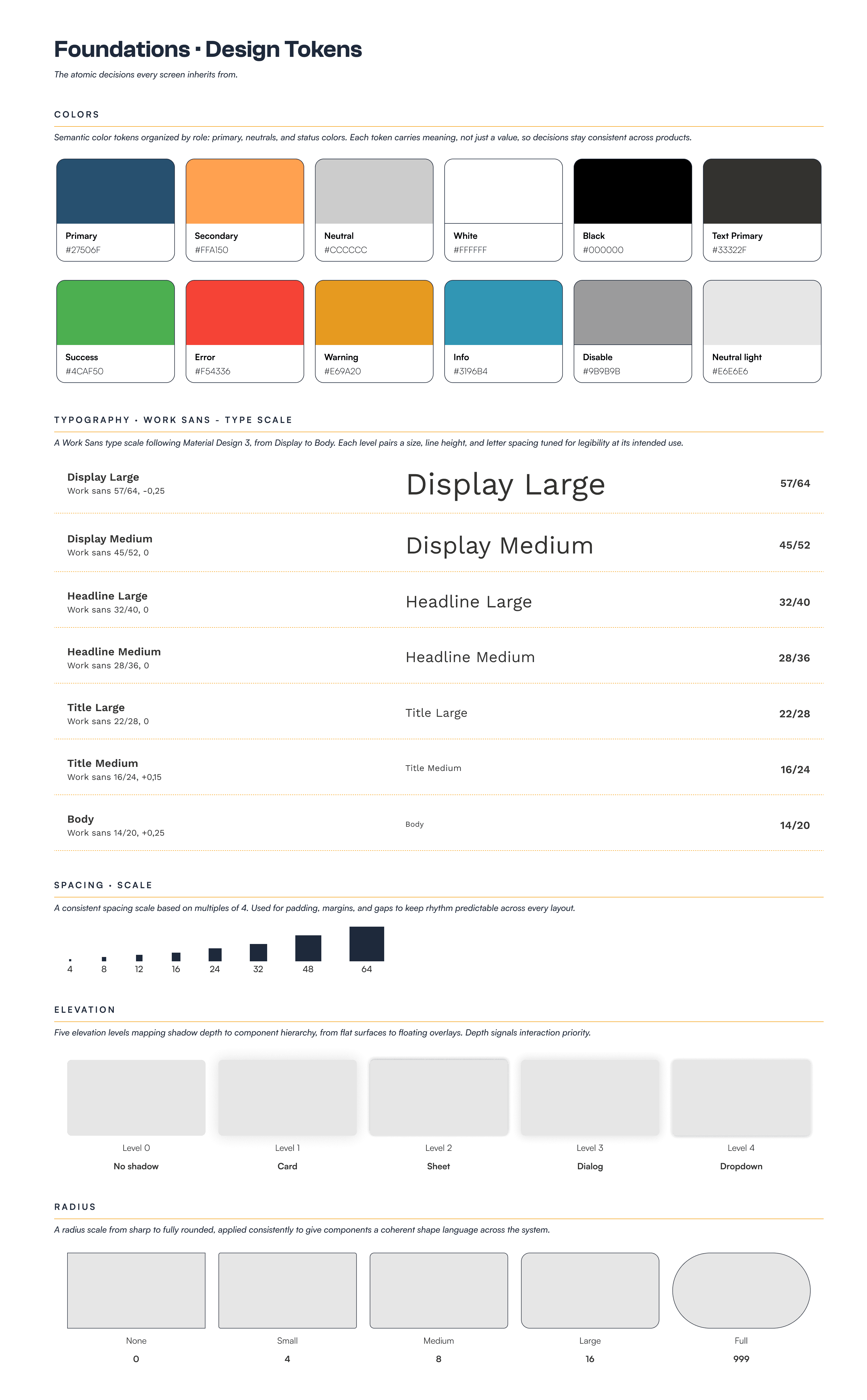
MY CONTRIBUTION
Defined the token architecture from scratch: a Material-aligned palette extended with Tierra-specific semantic colors, a complete type scale, and a coherent spacing/elevation/radius system. Tokens are organized to be both designer-friendly (semantic names like Primary/KIS) and developer-friendly (mappable to Flutter and CSS variables).
02 • Mobile components
The component library that powers Blend+ and other Tierra mobile apps. Built on Material Design 3, extended with Tierra-specific patterns for fleet and telematics contexts.
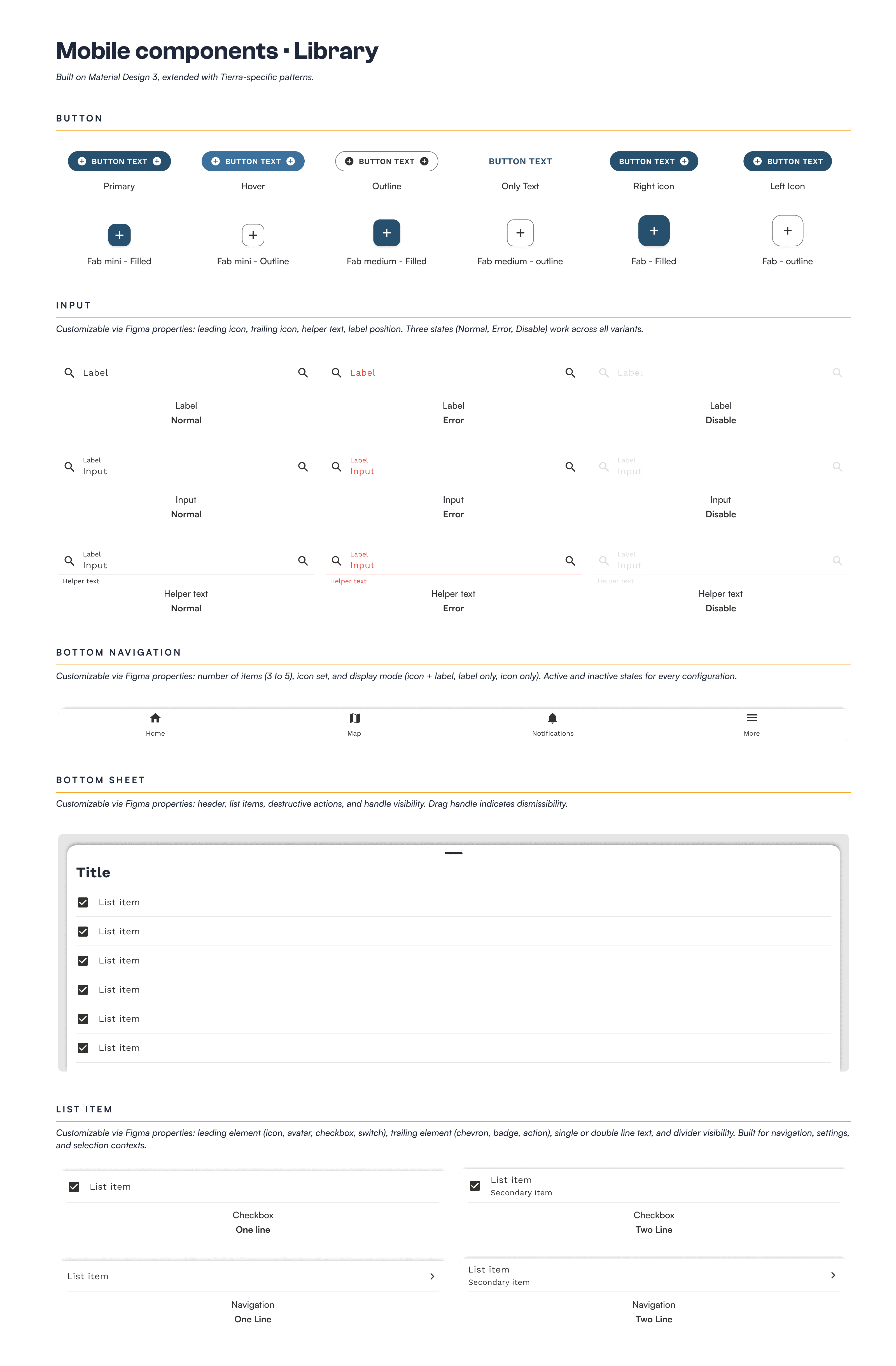
MY CONTRIBUTION
Designed the complete mobile component library from foundations to documented Figma variants. Built each component with multiple properties (size, color, state, icon support) to give designers and developers maximum flexibility without rebuilding patterns. Worked closely with the Flutter team to ensure Figma variants matched implementable widget props.
03 • Web components
Data-dense patterns built for desktop workflows. Where the mobile system optimizes for touch and one-handed use, the web system optimizes for information density and parallel tasks.
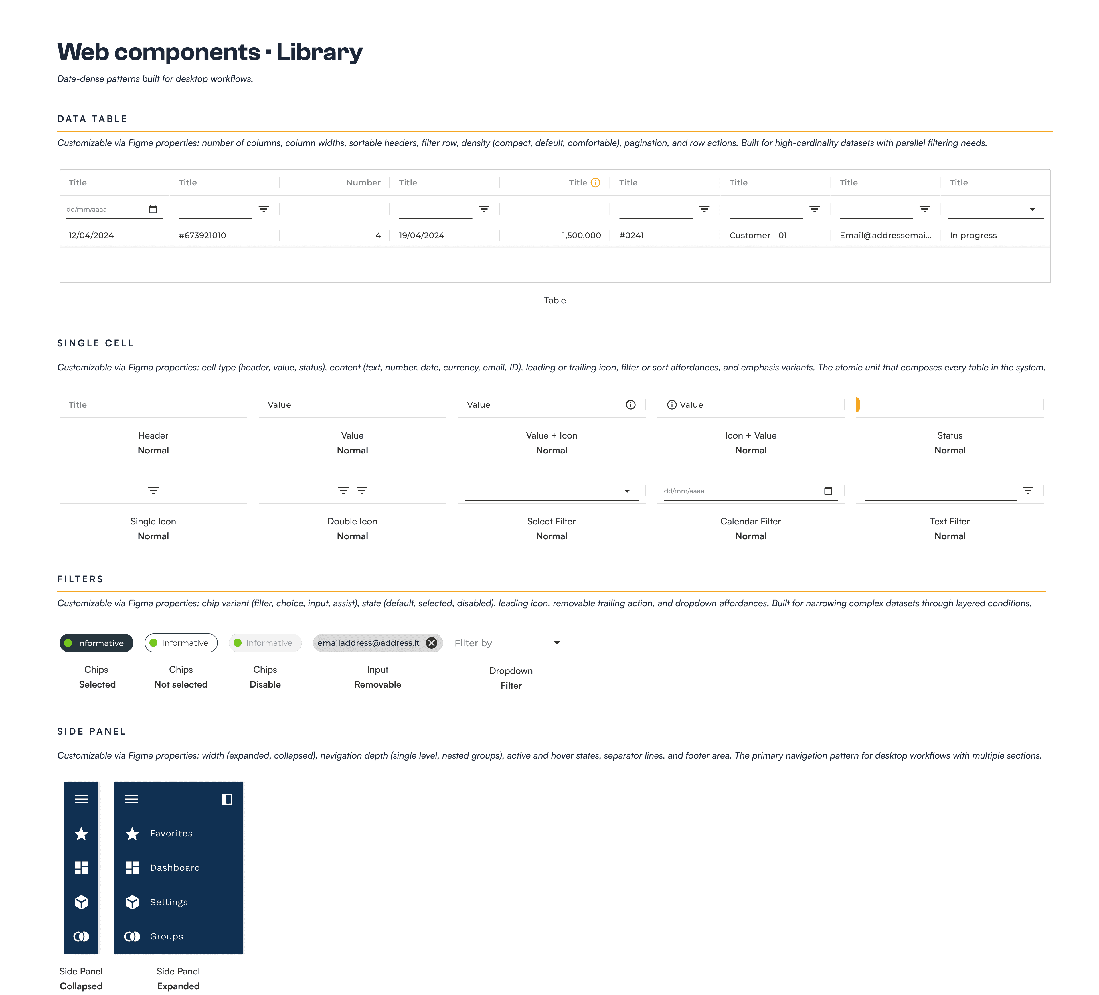
MY CONTRIBUTION
Adapted the foundations from the shared design system to web-specific patterns. Designed data tables with sortable columns and inline actions, filter systems for high-cardinality datasets, and the side panel + content layout that became Gazelle's signature navigation pattern. Documented when to use each pattern based on data density and user task.
04 • Iconography · Separate library, multiple style
Icons live in a dedicated library, consumed by both mobile and web systems. Built on Material's icon set, extended with custom icons for Tierra-specific concepts.
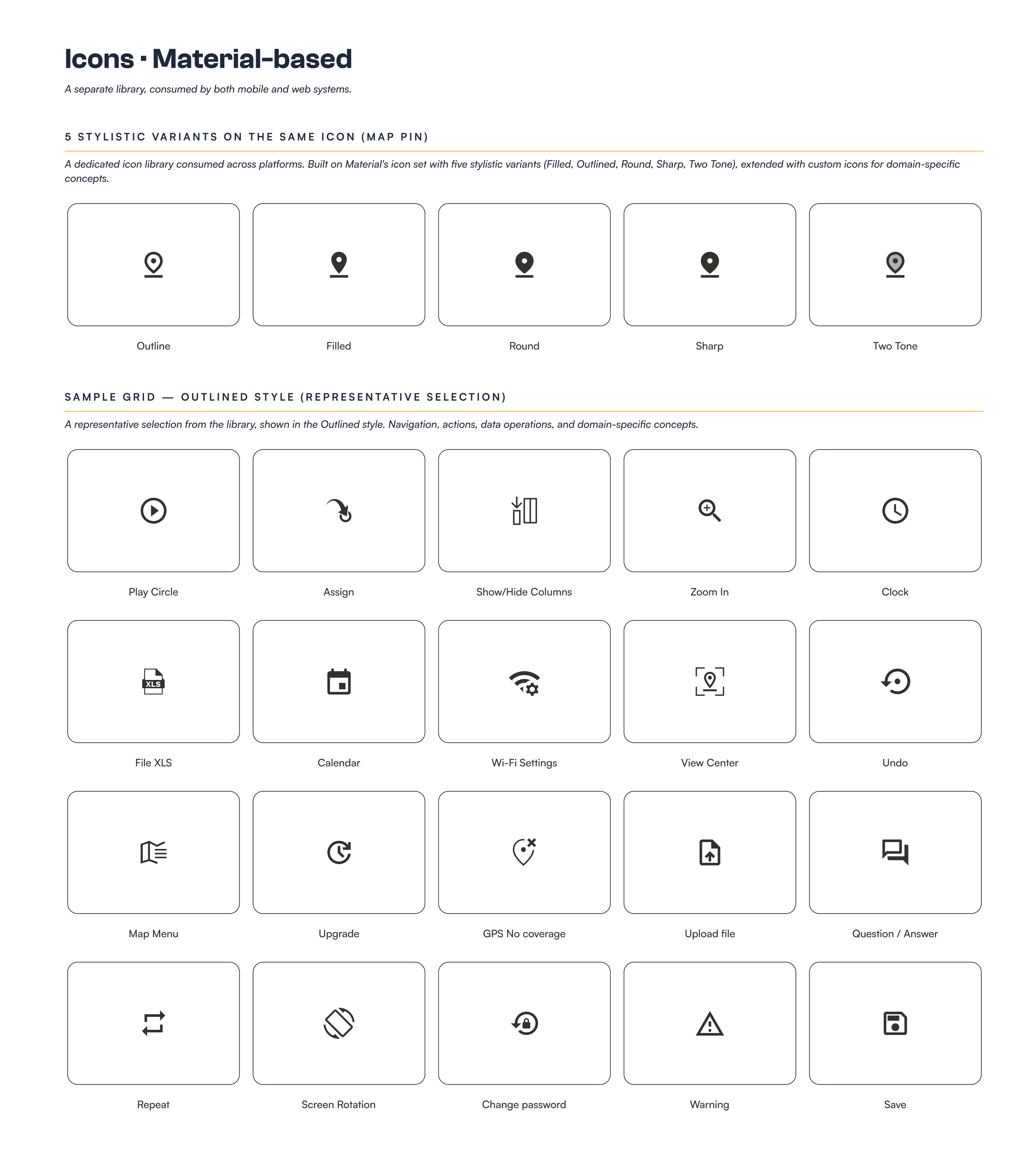
MY CONTRIBUTION
Set up the dedicated icon library separated from component libraries, so it could be consumed by both web and mobile. Established the five style variants for visual flexibility (Filled, Outlined, Round, Sharp, Two Tone) and extended Material's set with custom icons for Tierra-specific concepts like fleet states, vehicle types, and telematics signals.
05 • System architecture · Multi-file structure
How decisions flow from shared foundations to platform libraries to product implementations. The diagram that explains why 3 design systems for 5 products.
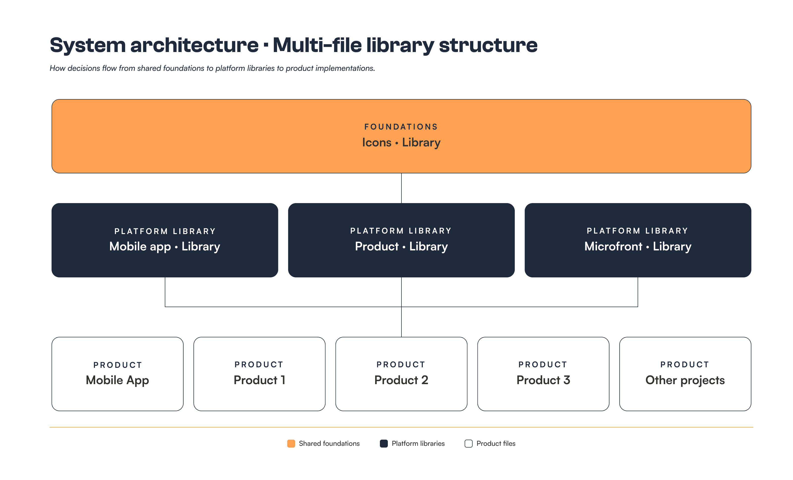
MY CONTRIBUTION
Designed the multi-file architecture that lets foundations stay shared while libraries can specialize per platform. Each file has a clear role and consumes only what it needs, so changes propagate predictably. This structure is what made it possible to maintain two design systems and serve five product teams without conflicts.