Website · UX, UI & Information Architecture
Organising a theatre company's whole world into one site
The brief
During my Erasmus at V-A Studio in Lisbon, I worked on the website for Teatro do Eléctrico, a Lisbon theatre company founded in 2008 around new dramaturgy and experimental staging. Alongside the Alter Solutions redesign, this was one of the sites I took on there.
The product
Not a landing page but a full multi-page site: a home, a company section covering history, team biographies and a press archive, a growing catalogue of shows with individual show pages, and contacts, all in three languages (PT, EN, FR). The risk was obvious: a lot of content flattening into long, undifferentiated lists.
My approach
Sitemap and references first, then an information architecture that could carry a catalogue that keeps growing: a persistent navigation, a filterable shows grid, and one repeatable show-page template. Only then the UI, deliberately quiet, to let the show photography lead.
my role
Working at V-A Studio, I owned both structure and surface on this project: UX and information architecture through to the finished UI. The studio's developers built the front-end from my designs, so I could focus entirely on how the site was organised and how it looked.
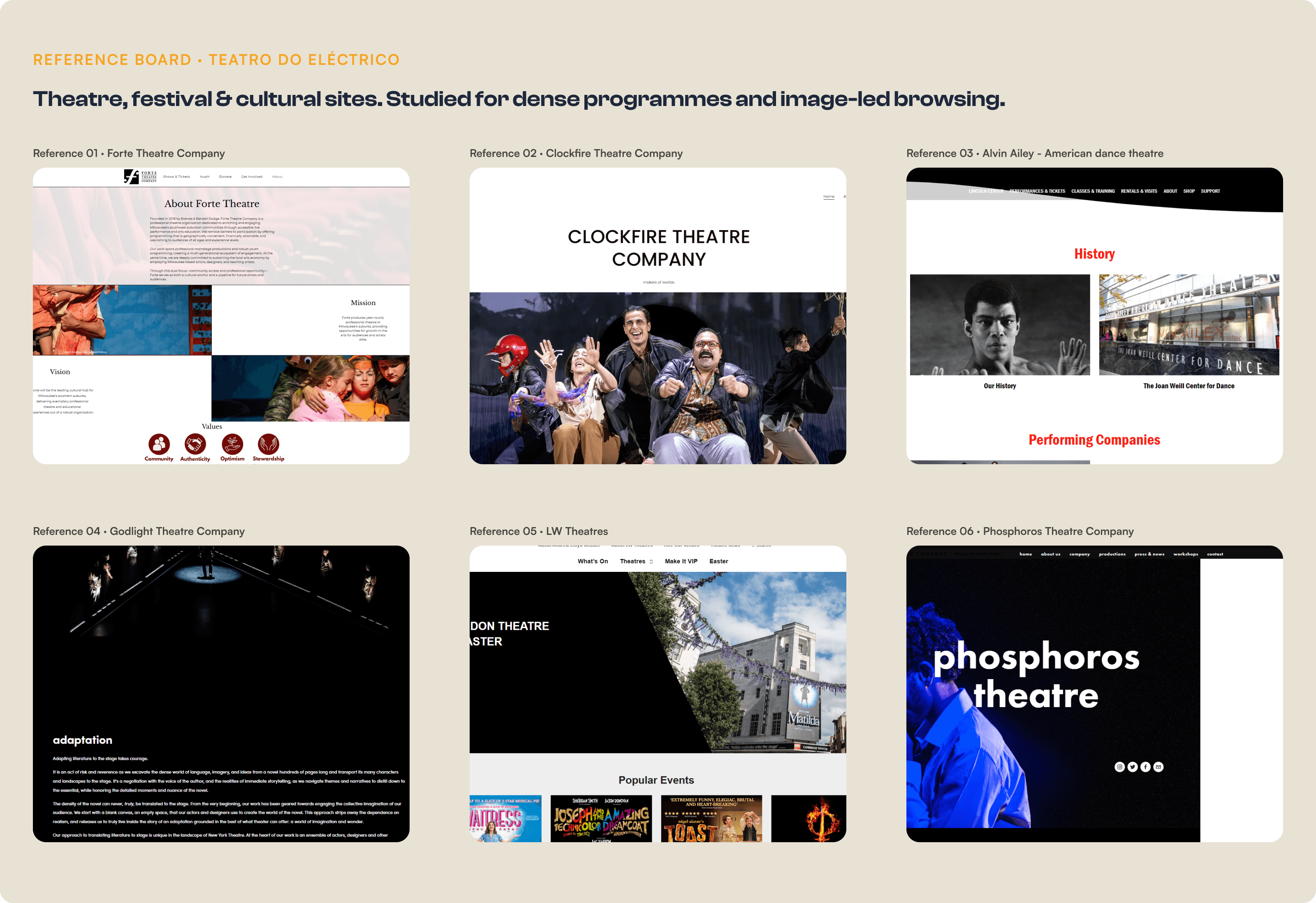
Before structuring anything, I studied how theatres, festivals and cultural institutions organise dense programmes and rich photography: what they surface first, and where navigation breaks down for someone just browsing. The recurring lesson shaped everything after: let the images carry the mood, and keep the structure doing the quiet work underneath.
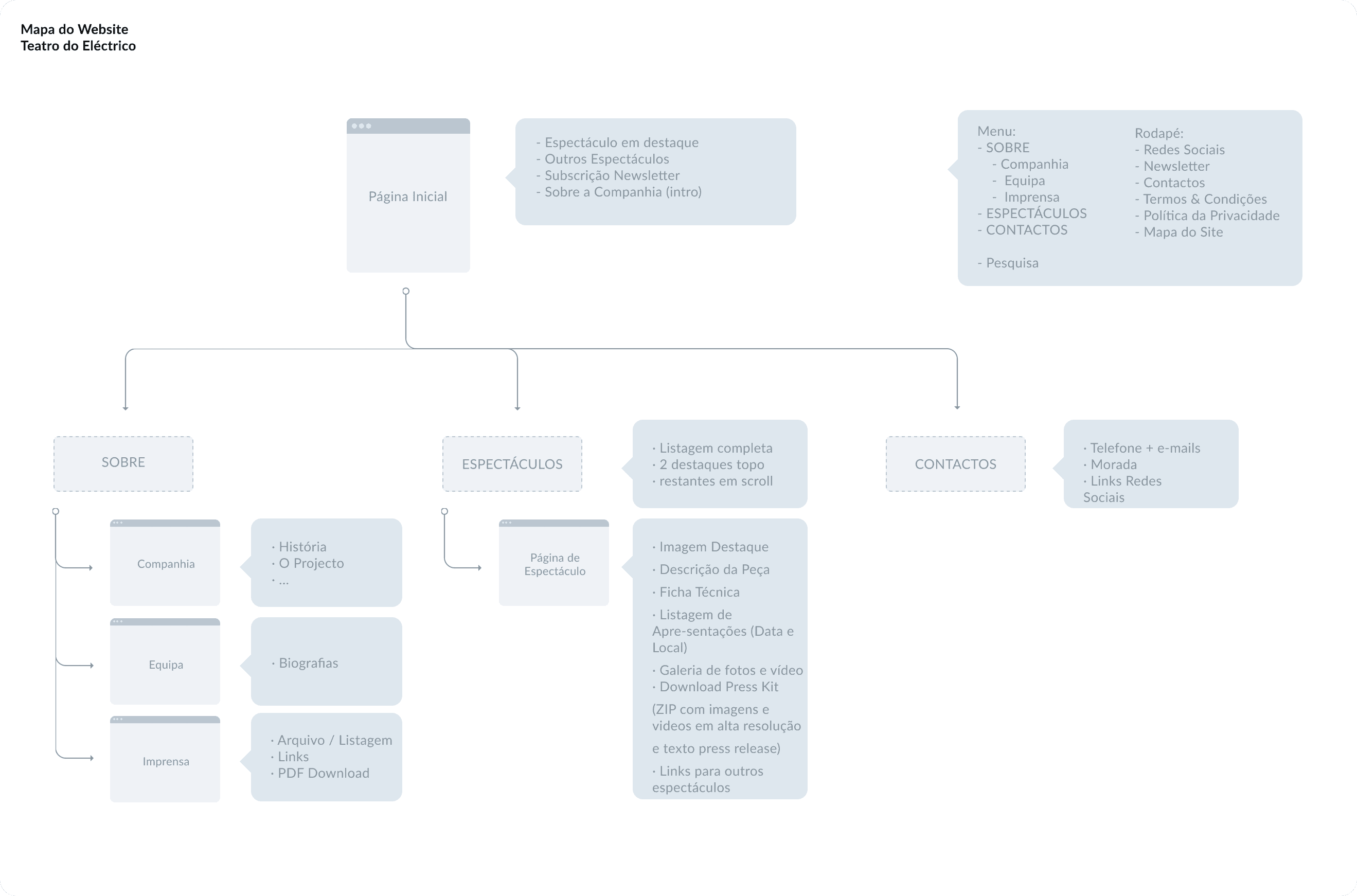
The site needed a backbone. I mapped it as real, distinct pages: a home, a Sobre section branching into three, Companhia, Equipa and Imprensa, an Espectáculos listing that drills down to individual show pages, and Contactos. Grouping company, team and press under one menu keeps the top level simple, while the catalogue runs from the full grid down to a single show with no dead ends in between.
Process
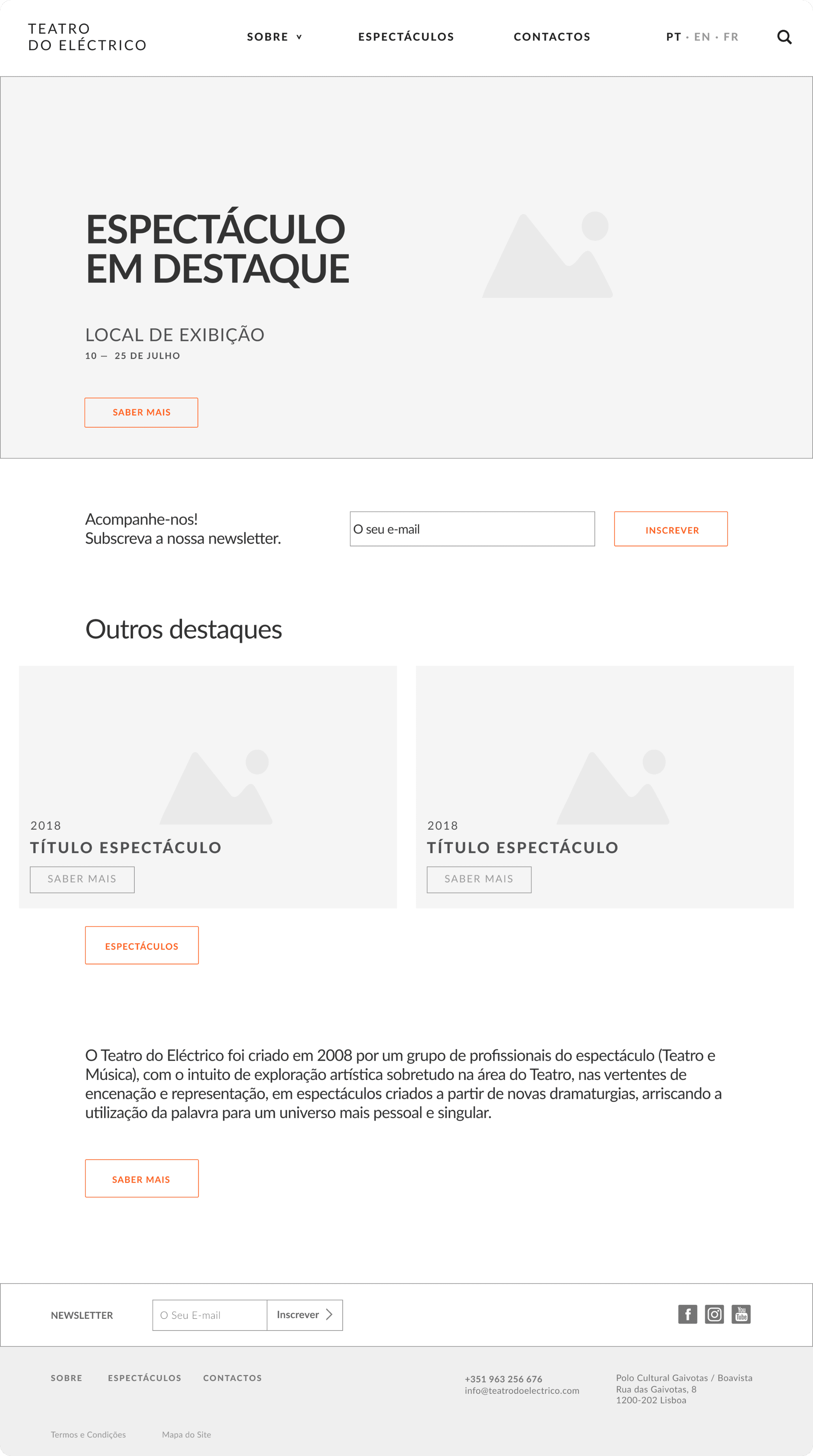
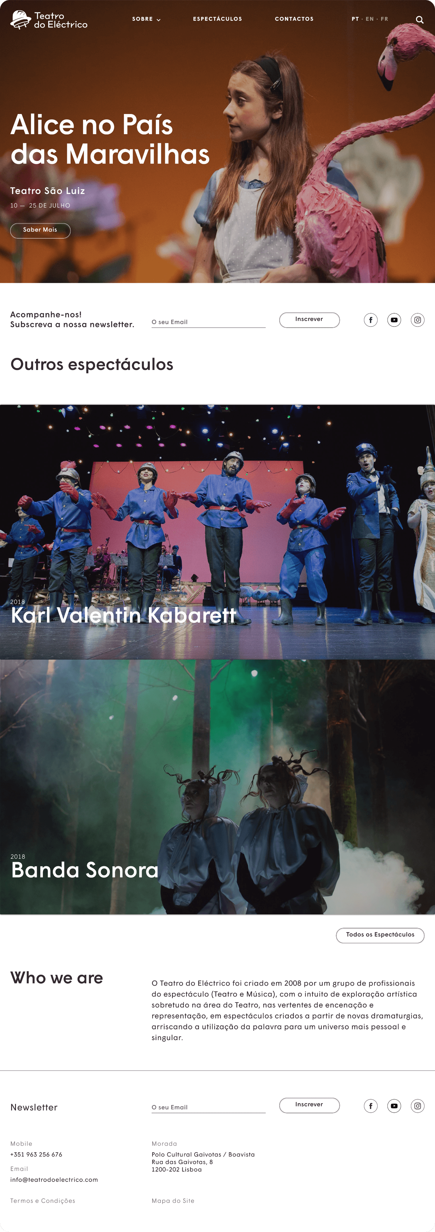
With the architecture in place, I wireframed each template before styling, then made every part of the site hold together, from the shifting home to the deep show page. Each template had a single job, and the structure kept it consistent and easy to browse however much the catalogue grew. The section below pairs each wireframe with its finished UI.
01 · FRAME
A shifting shop window
homepage
Featured show
02 · BROWSE
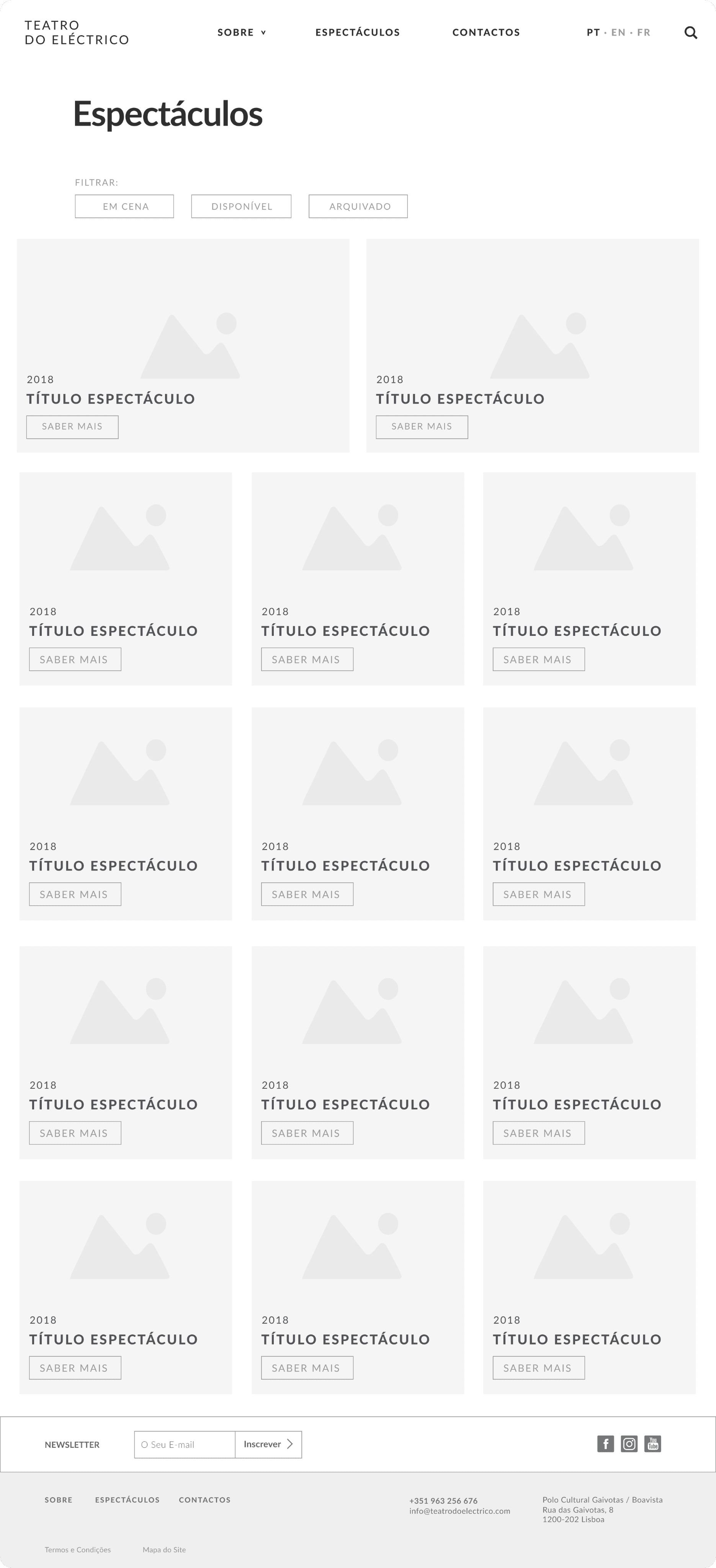
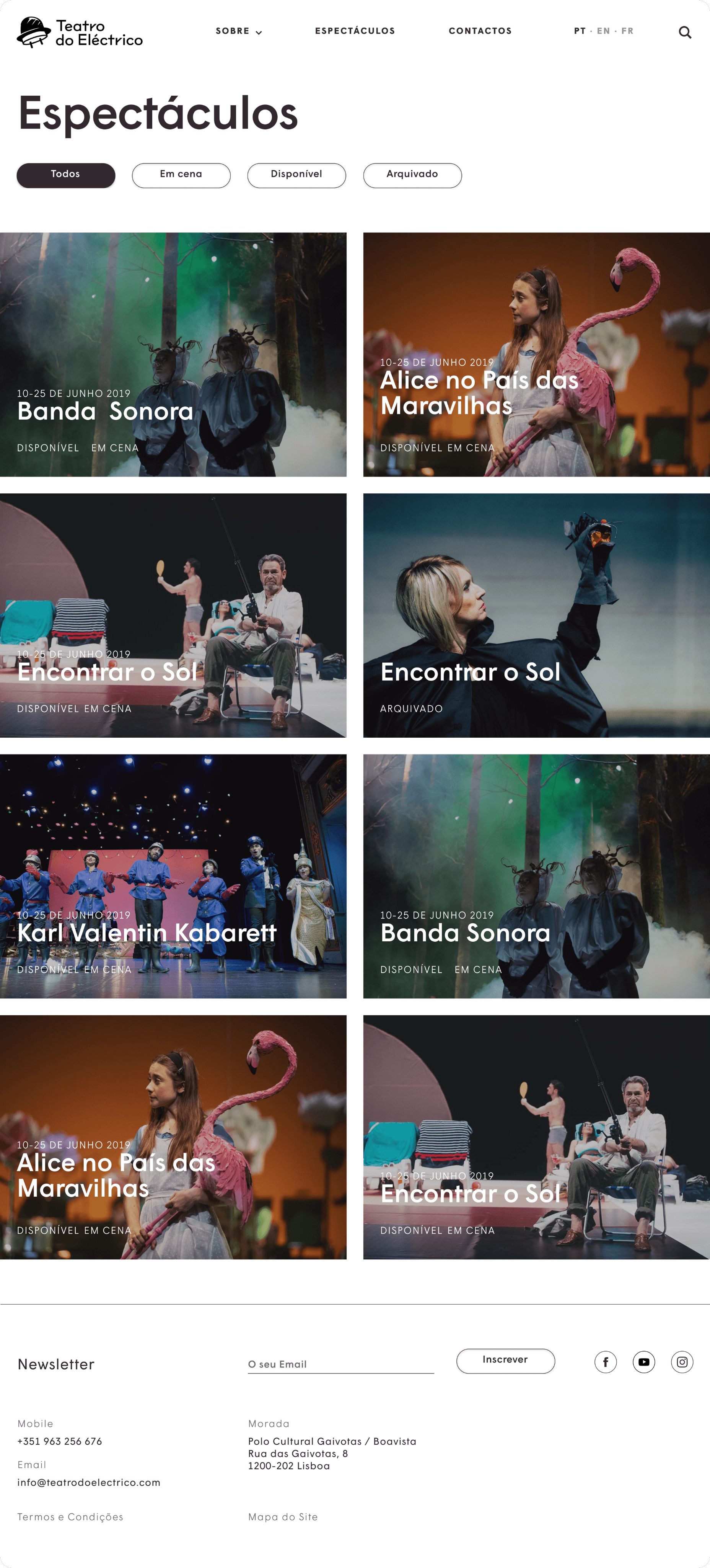
A catalogue that scales
Filter system
Image-card grid
03 · DIVE
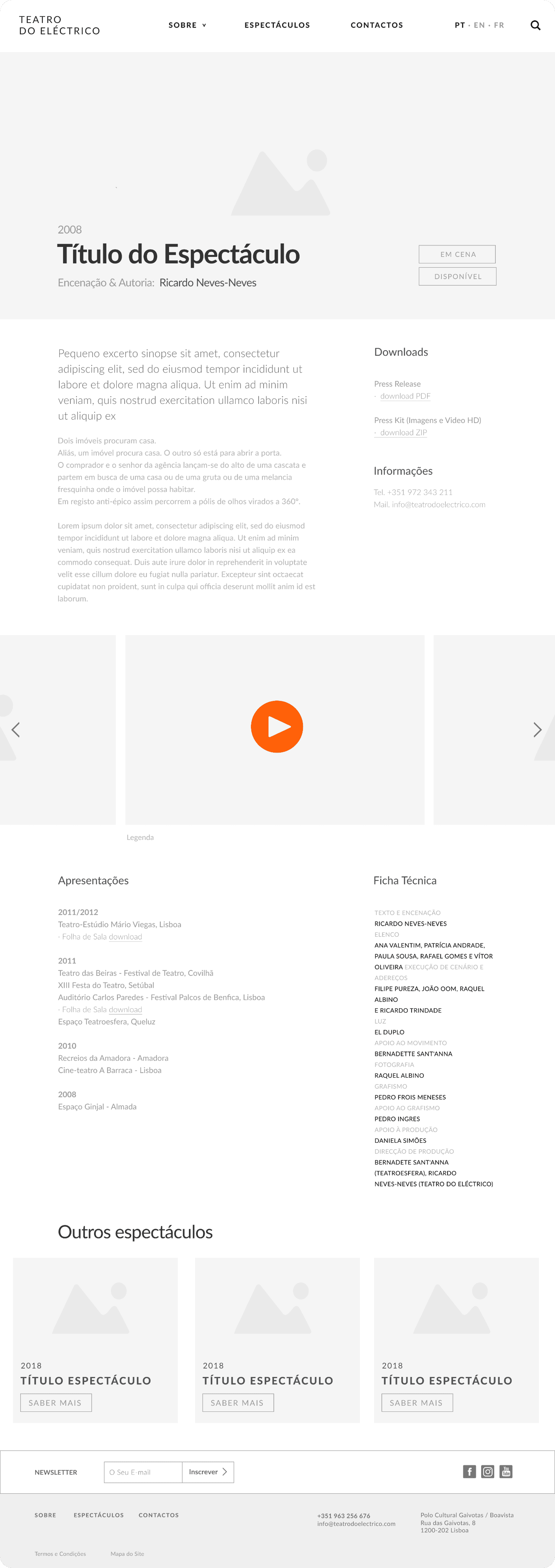
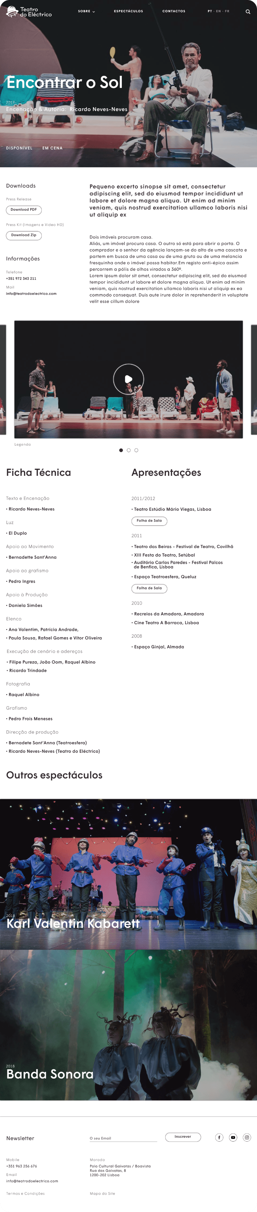
One template, every show
Template design
Content modelling
04 · ARCHIVE
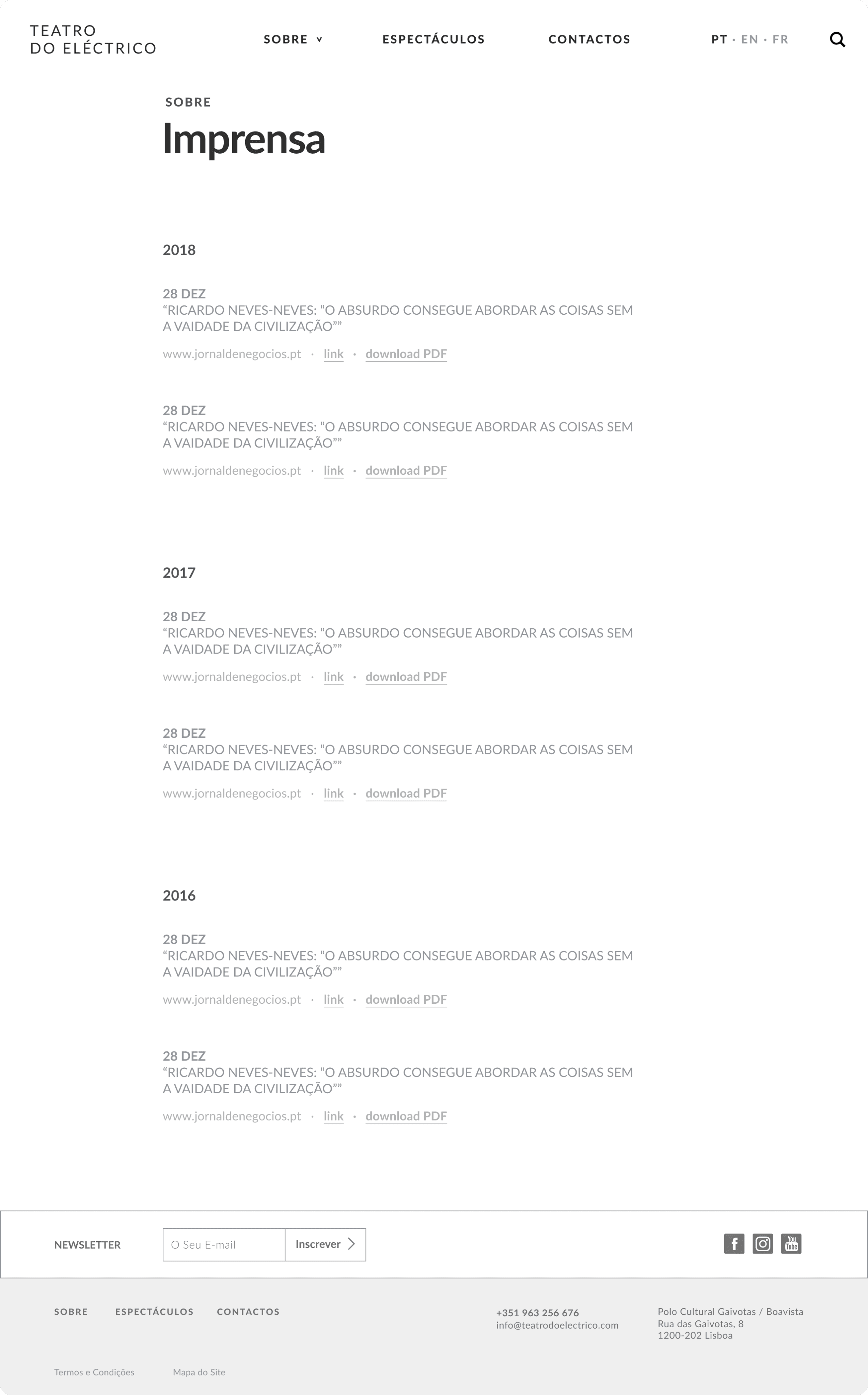
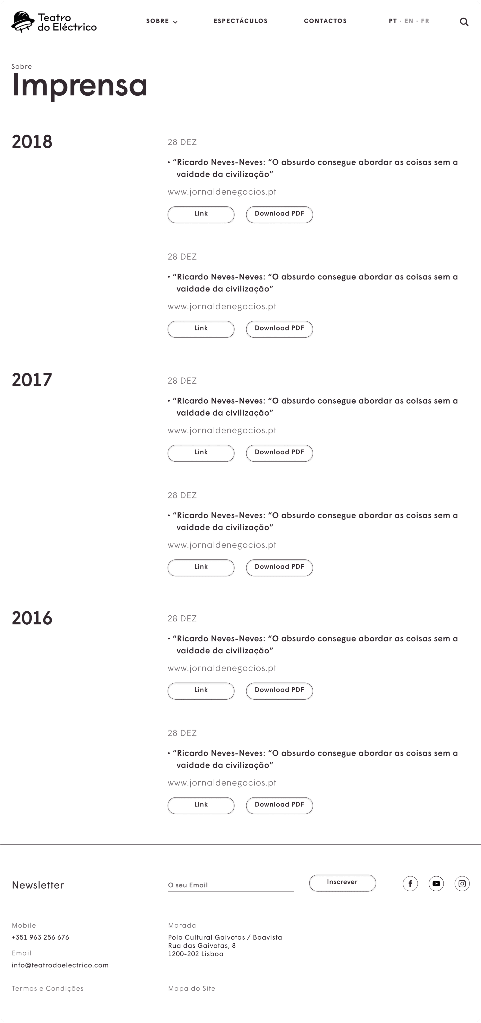
Keep the record tidy
Press archive
PT · EN · FR
01 • Home
MY CONTRIBUTION
Set the featured-show hero pattern and the page rhythm, from wireframe to finished UI.
02 • Catalogue
MY CONTRIBUTION
Designed the filter system, the highlight-plus-grid layout and its UI.
03 • Template
MY CONTRIBUTION
Designed the template, and its UI, holding synopsis, ficha técnica, gallery and tour dates.
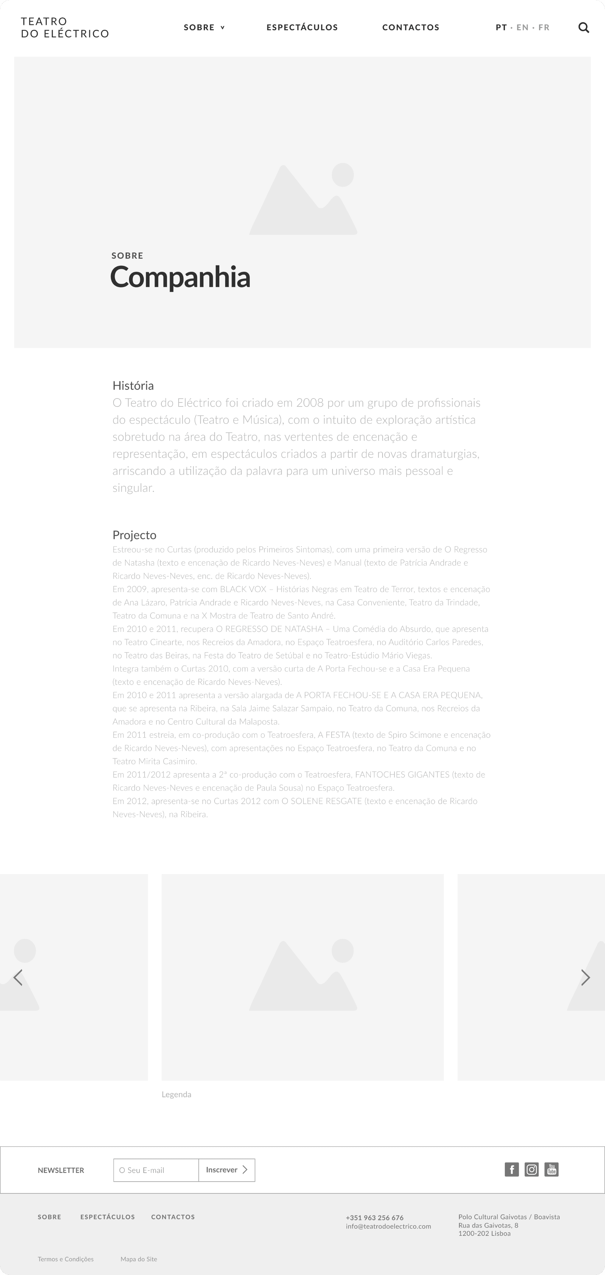
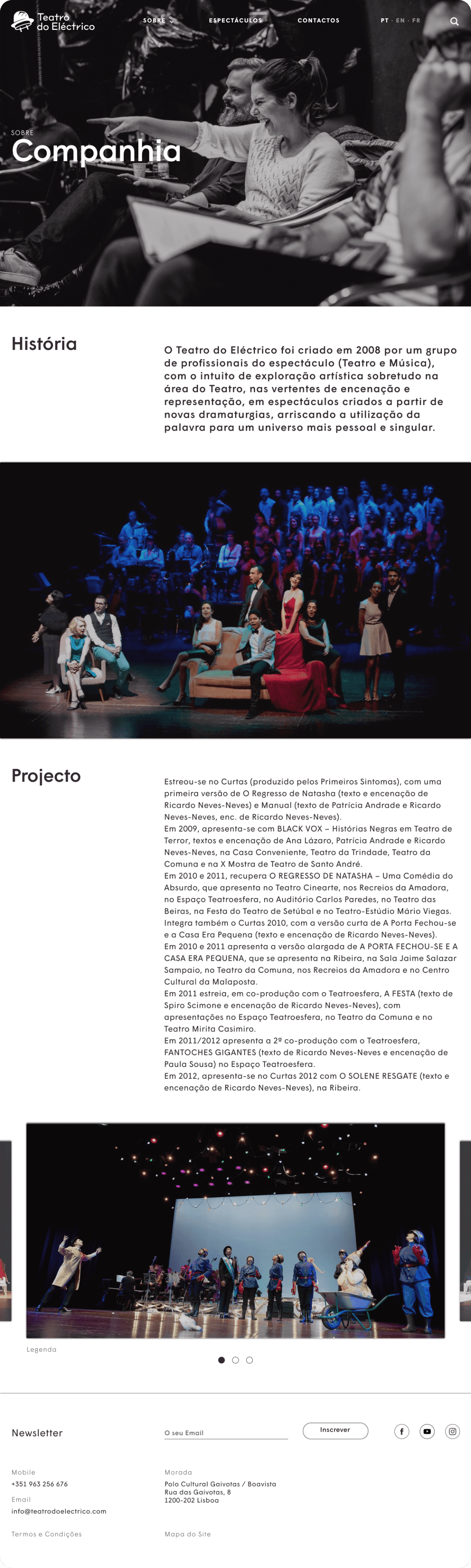
04 • Company
MY CONTRIBUTION
Structured a long text page around image breaks to keep it readable.
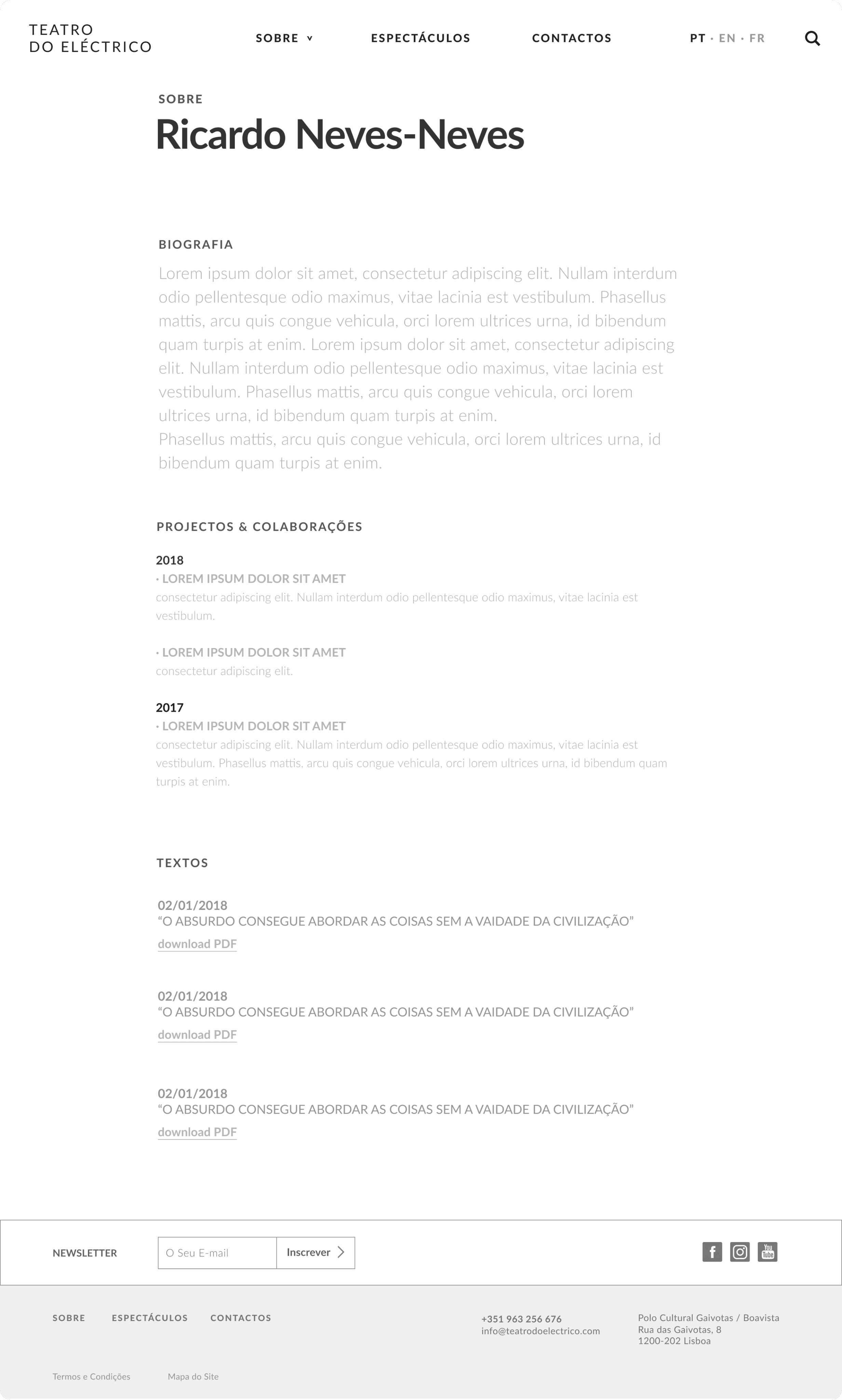
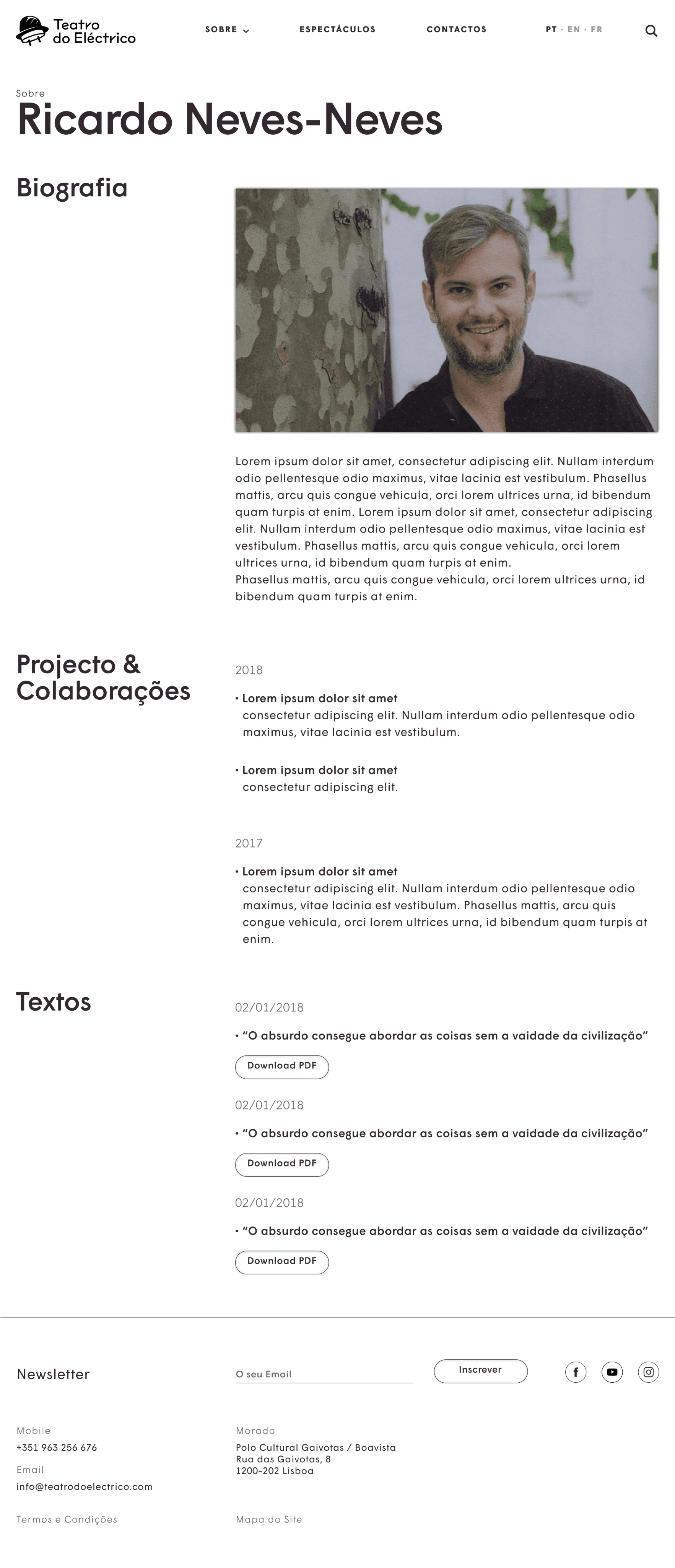
05 • Team
MY CONTRIBUTION
Designed the biography template: bio, projects and a texts / PDF list.
06 • Archive
MY CONTRIBUTION
Designed the year-grouped list and the dual link / download pattern.
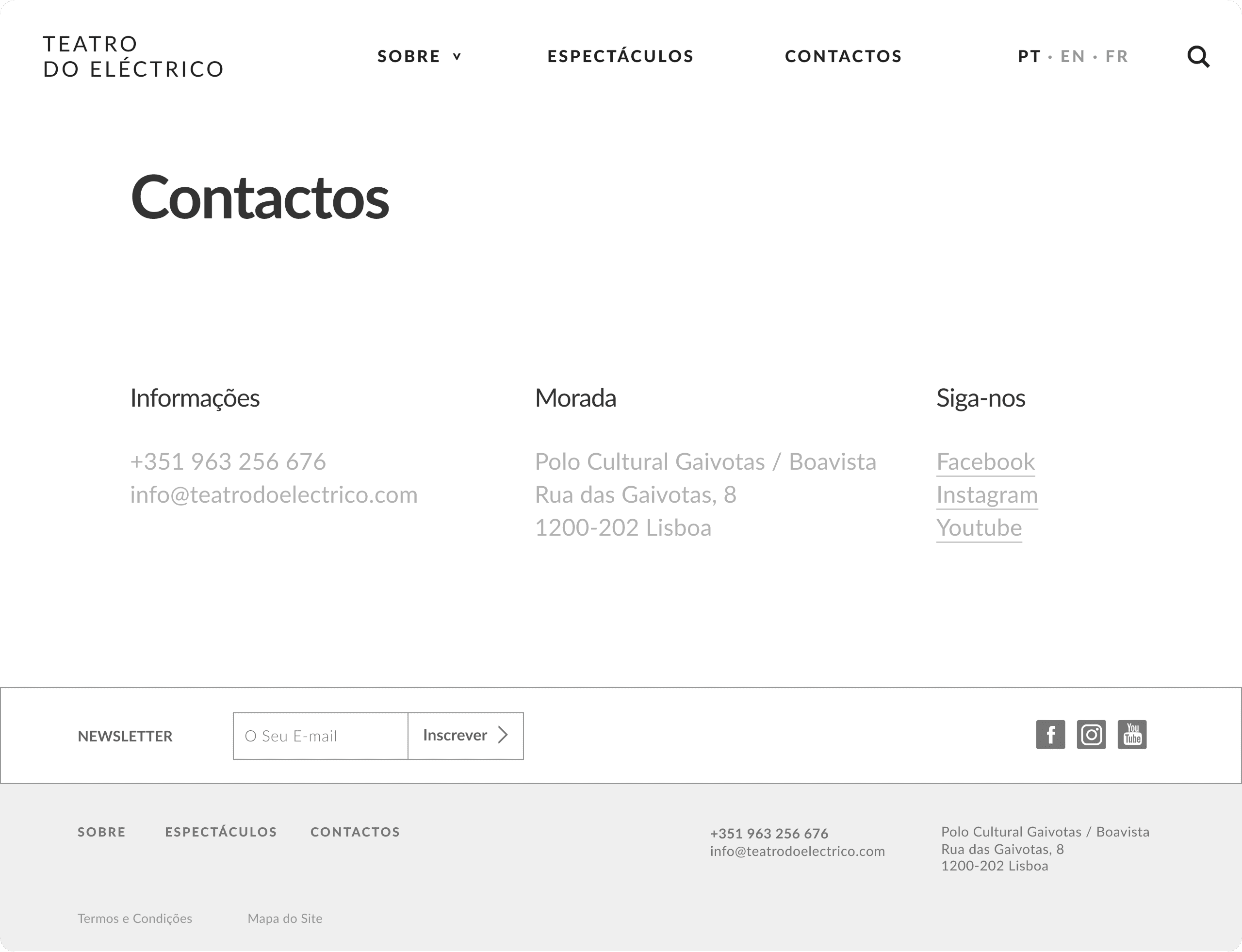
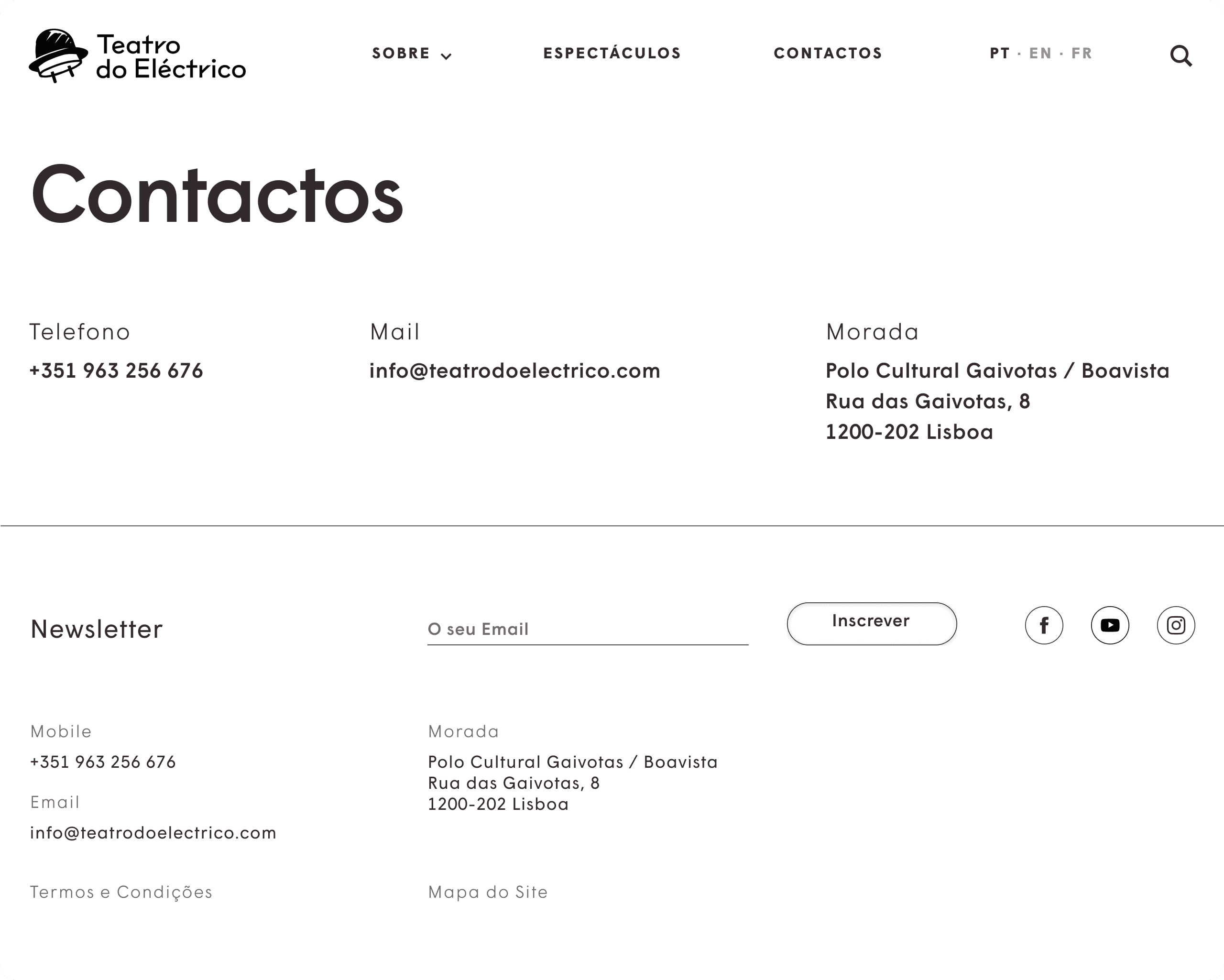
07 • Contact
MY CONTRIBUTION
Designed the contact layout and the shared footer used site-wide.
What I'd carry forward
Test the filters with real visitors.
The on-stage / available / archived split made sense to us; I'd check whether audiences reach for the same categories, or search by title and date instead.
Pressure-test the show template.
One template across very different productions is efficient, but I'd stress the edge cases, the sparsest and the most documented shows, so none feels cramped or padded.
Design the empty and overflowing states.
A catalogue that grows for years needs a plan for both a nearly empty archive and a very full one; I'd define those states up front next time.