Website · UX & Information Architecture
Designing features that stayed.
The context
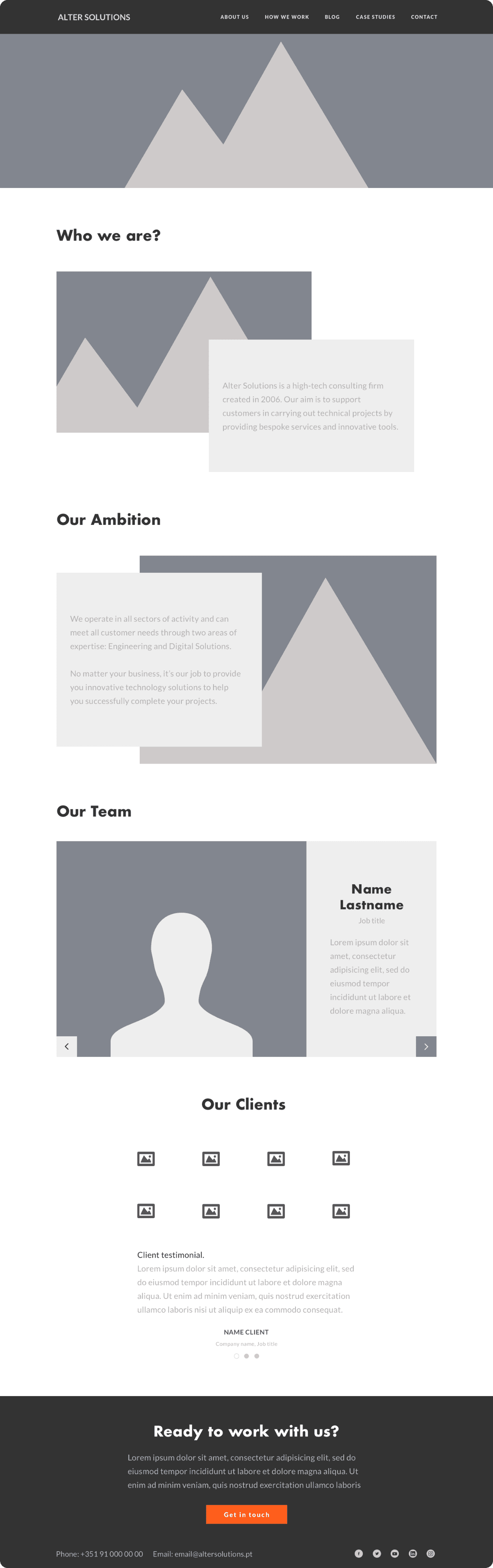
During my Erasmus traineeship I joined V-A Studio in Lisbon, an independent brand and digital product agency. Alter Solutions, a high-tech consulting firm, ran a nearshore branch in Portugal and wanted a website that set it apart from the group's other locations. Something with its own identity, not another copy of the corporate template
The brief
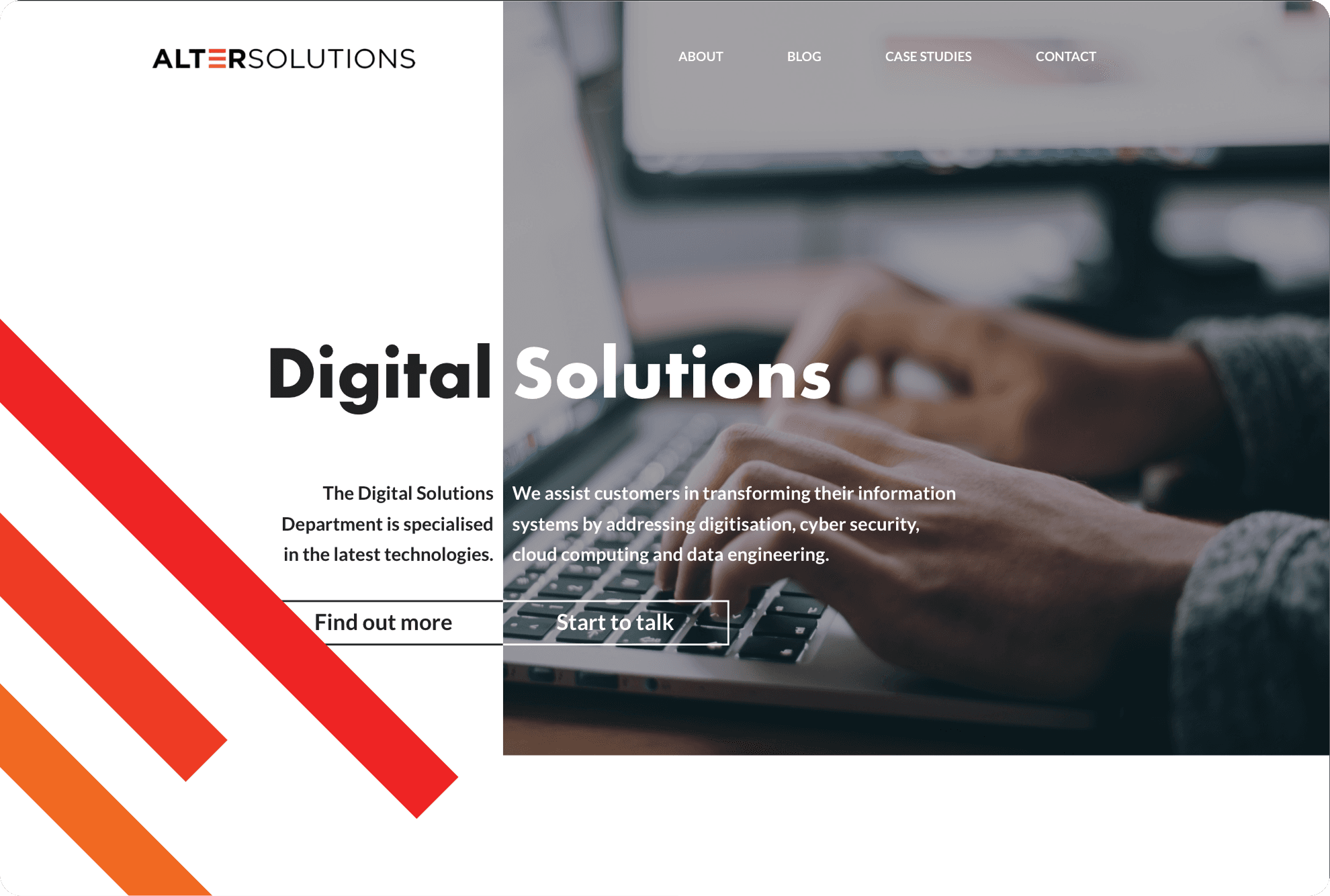
Redesign the nearshore site end to end so it felt modern, fresh and distinctly theirs, while staying credible for an enterprise audience of CTOs and procurement teams looking for an outsourcing partner.
My role
I owned the project from reference research through UX, UI and an initial front-end build, working under a tutor inside the studio. It was the first time I took a real client brief all the way from a blank page to a coded homepage.
tIMELINE
A four month traineeship in 2019. Two weeks of competitor analysis, then UX, UI in two passes, and a final stretch coding the homepage before the stage ended.
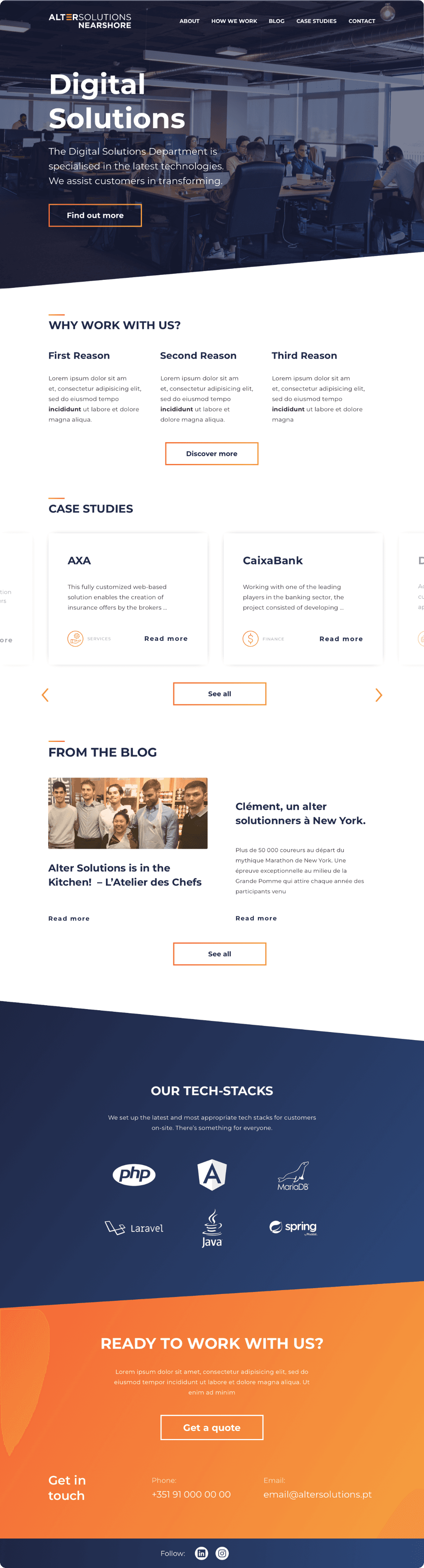
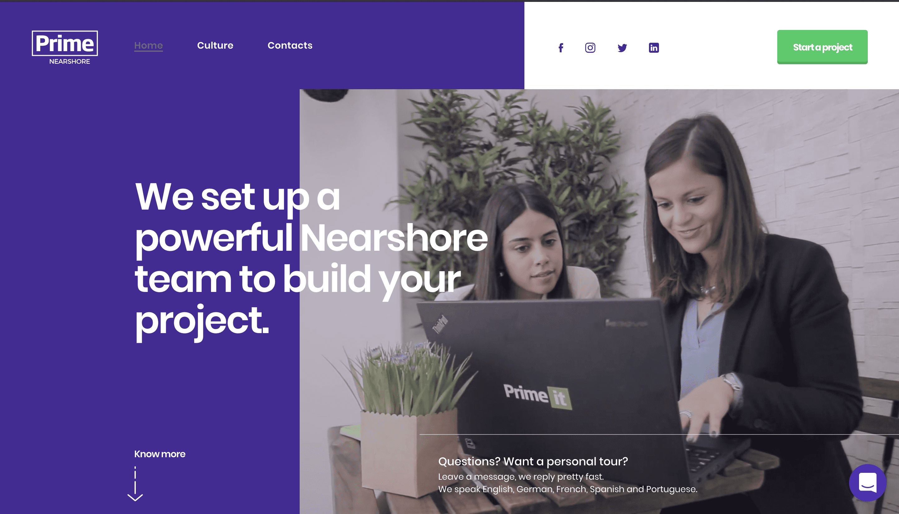
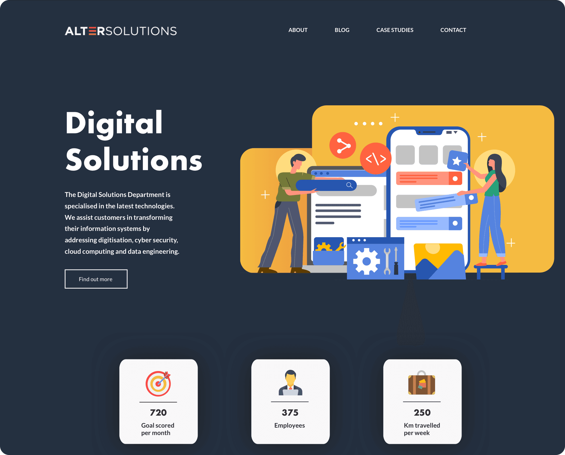
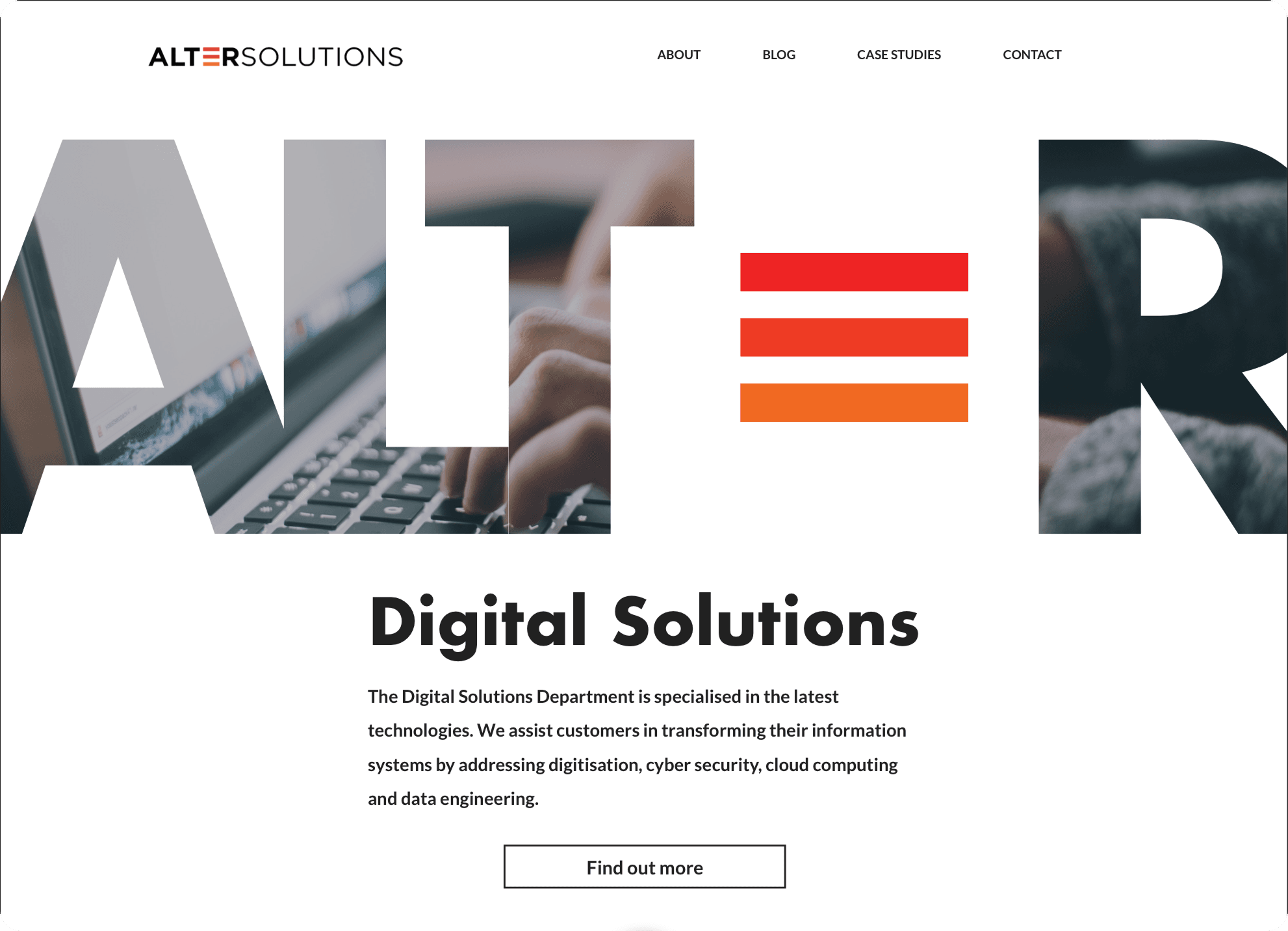
The client started us with almost nothing: one logo and one very loud orange. Modern, fresh, simple were the words that had to survive every decision. So before touching a layout, I built the visual system the site would be made of.
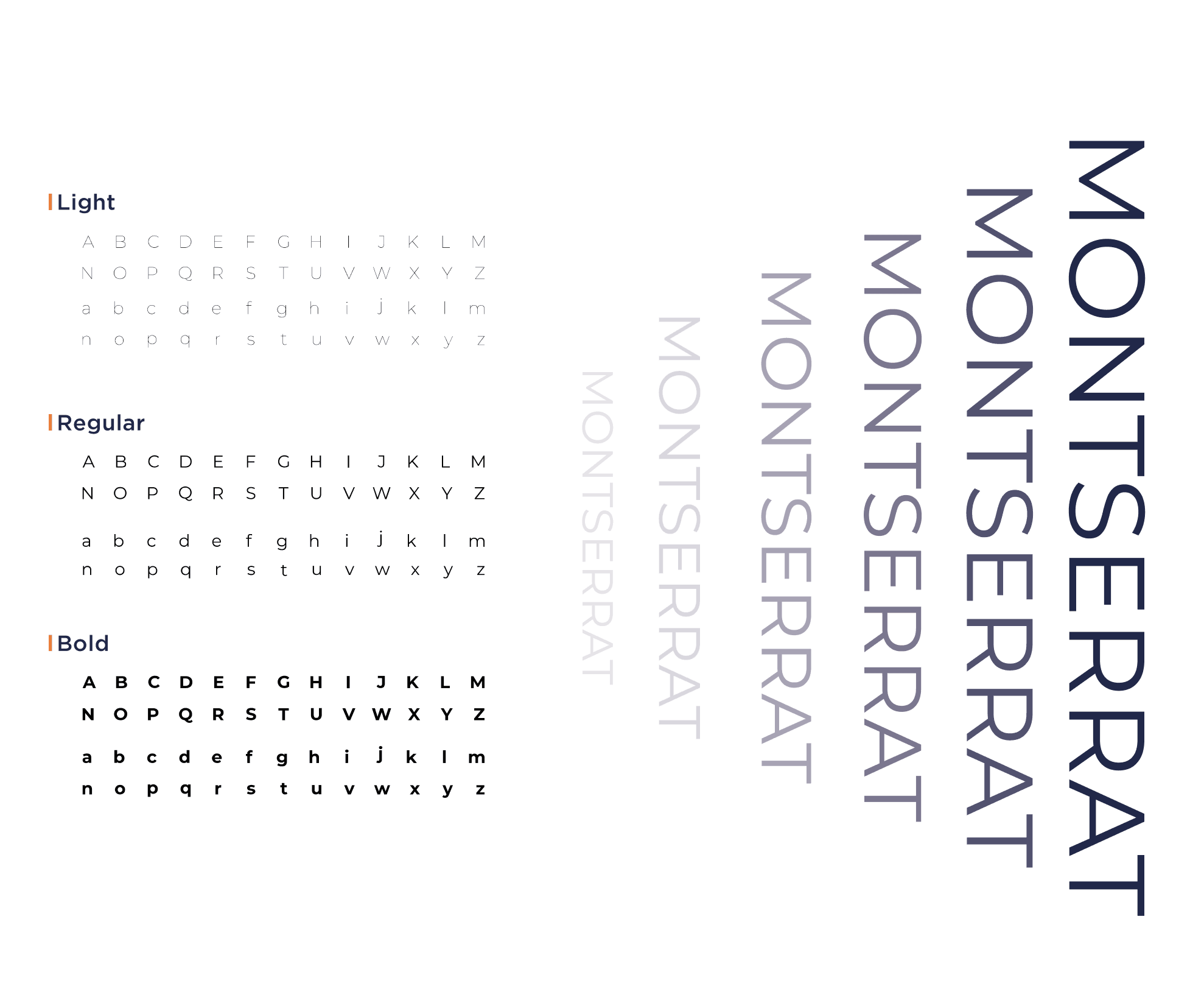
01 • Typography
Working from the logo's geometry, my tutor and I tested two geometric sans pairings, Futura PT and Montserrat. Both read as modern and on trend without fighting the brand. We landed on Montserrat, a modernist sans inspired by old Buenos Aires signage that feels less formal than Futura, used across light, regular and bold.
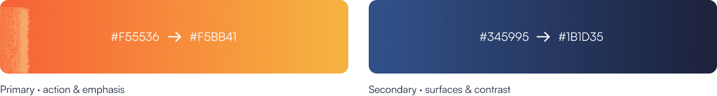
02 • Color
The supplied orange was almost too heavy to use raw. Instead of toning it down, I built two gradients around it. A warm orange to amber primary for emphasis and calls to action, and a cool navy to blue secondary for surfaces, footers and anything that needed to stay calm. The warm one shouts where it matters, the cool one keeps the rest readable.
03 • Diagonals
Among the assets the client shared, the diagonal cuts stood out. I pulled them into the site as a recurring motif, slicing hero images and section edges to add movement and keep an enterprise layout from feeling static.

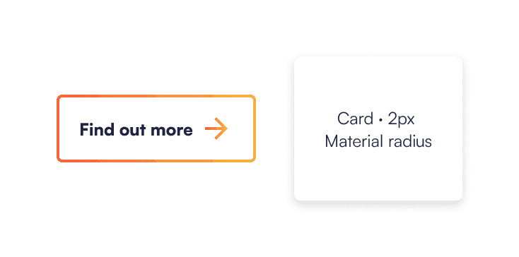
04 • Components
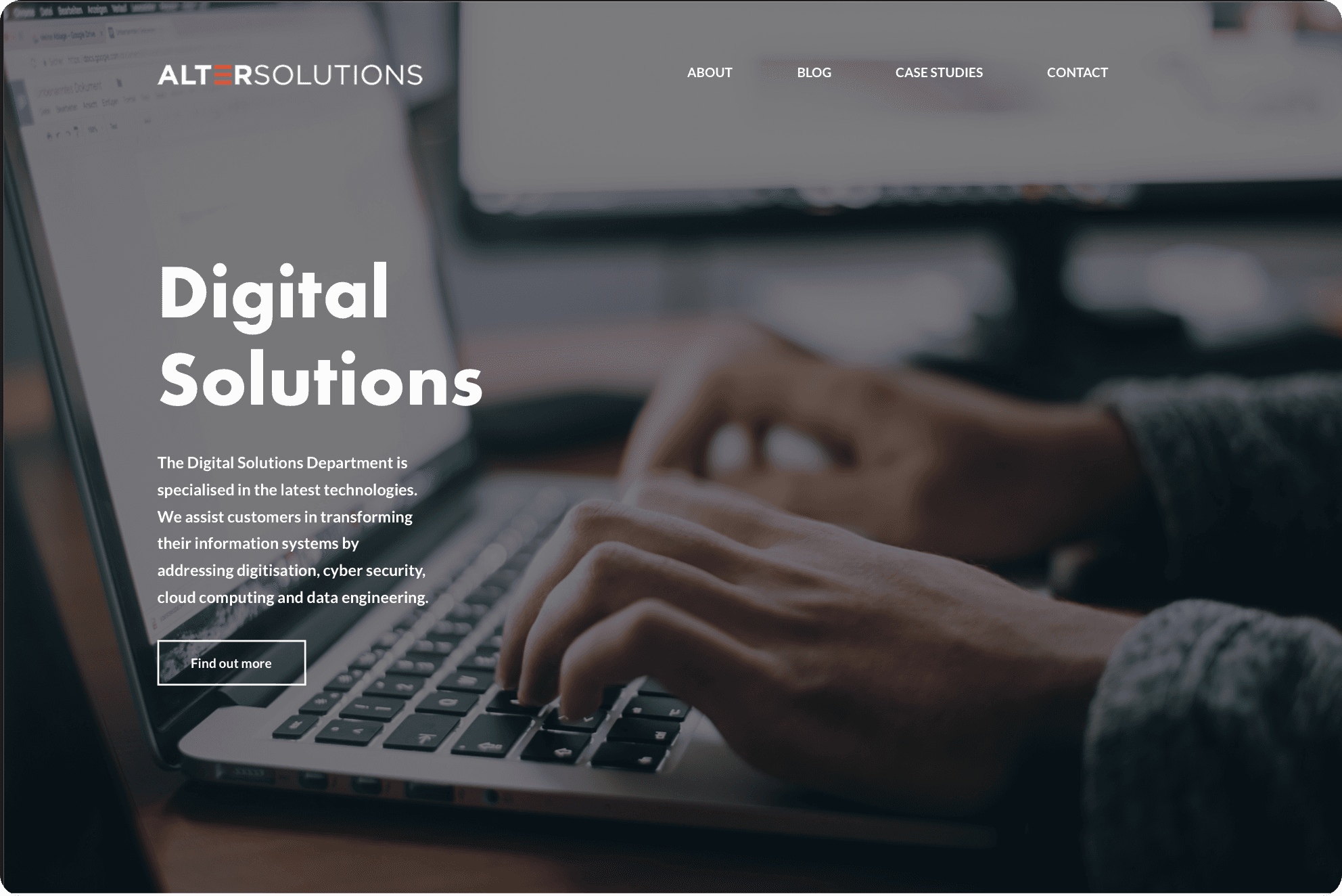
The calls to action use an outline style, so a hover state turns a small detail into a real interaction cue. That outline choice then set the tone for every icon on the site. Cards follow a 2px Material radius, kept identical wherever they appear so the system never fragments across pages.
Nearshore outsourcing was a domain I knew nothing about. Before designing anything, I spent two weeks studying competitors to understand the patterns the audience already expected, and the gaps worth filling.
1
What worked
Bright, high contrast palettes that read as modern yet formal. A quote oriented call to action that turned a vague "contact us" into a guided, answerable request.
2
A gap to fill
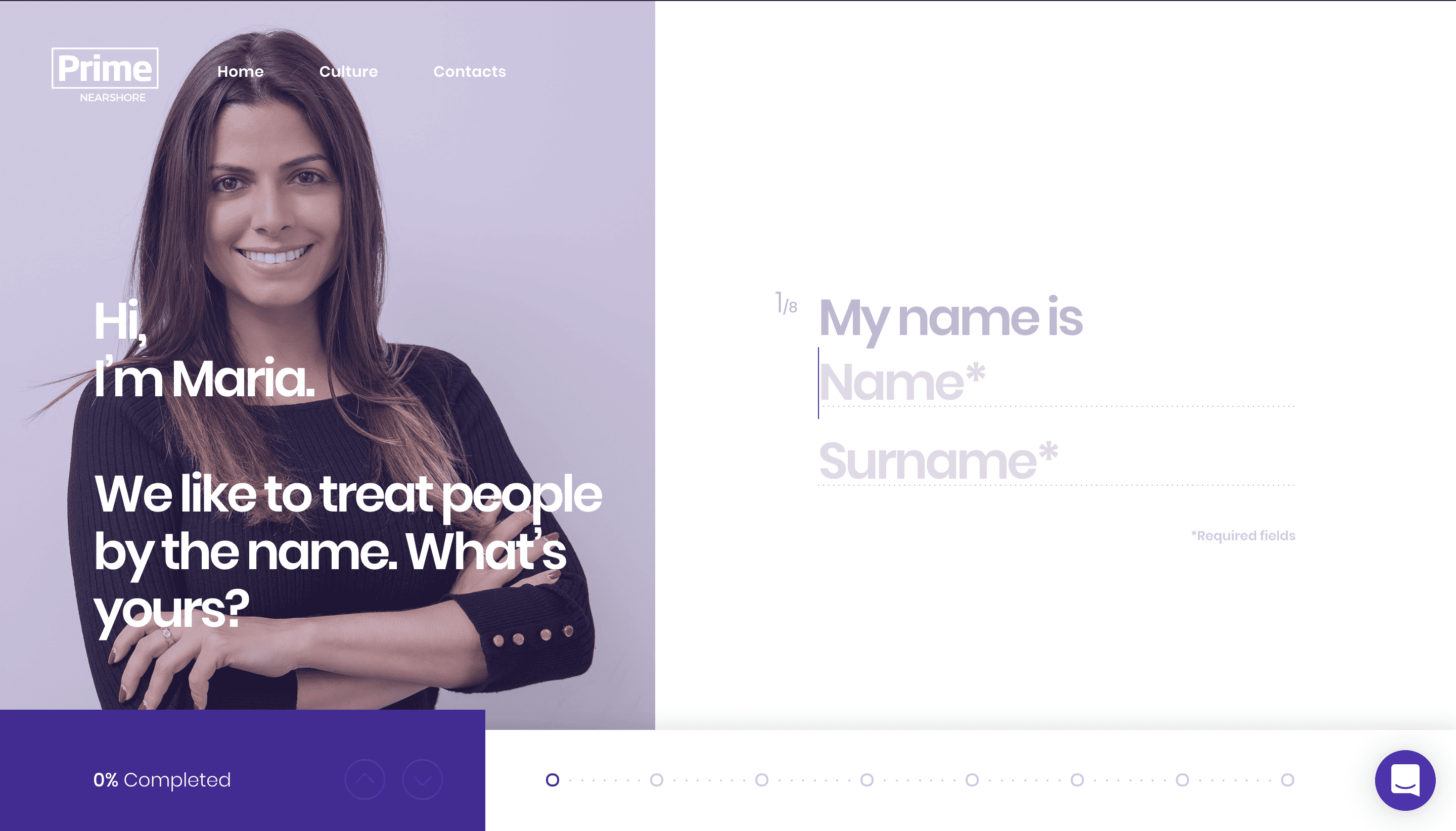
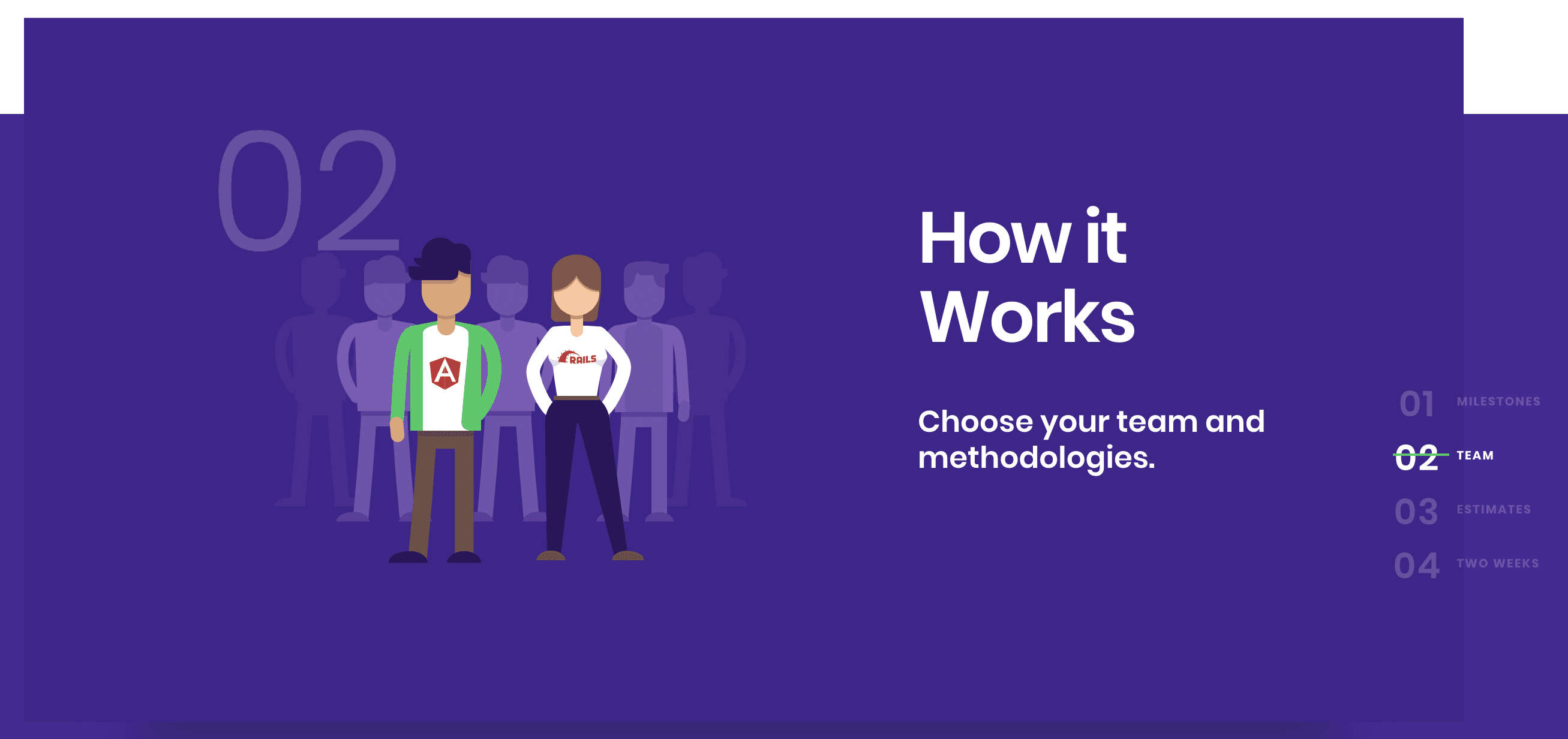
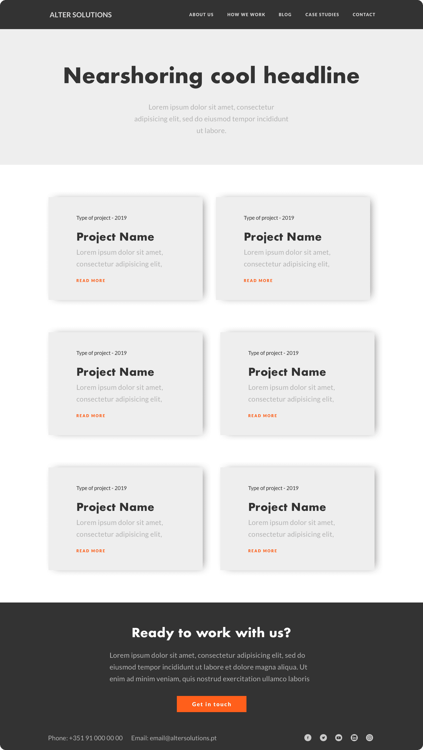
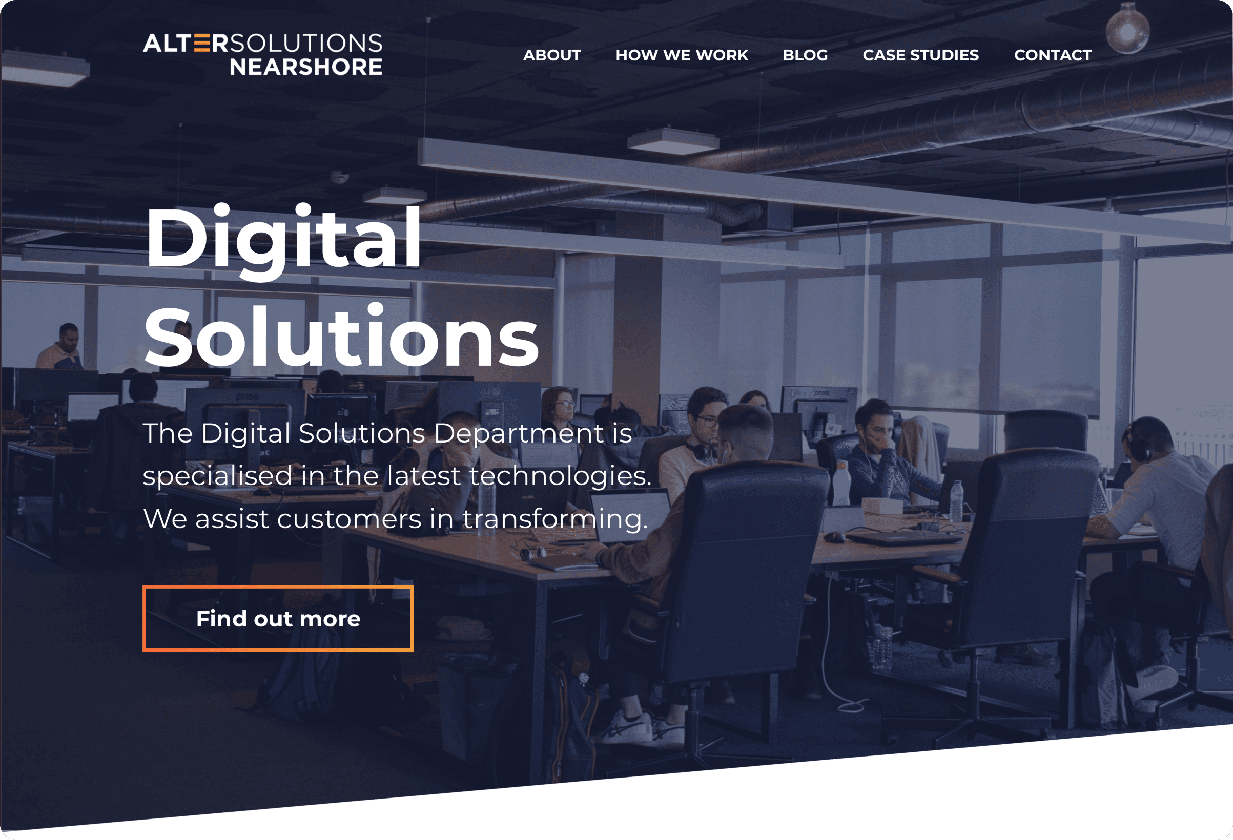
None of the sites explained how the teams actually worked. I proposed a dedicated "How we work" section, which the client accepted with enthusiasm.
3
A structural choice
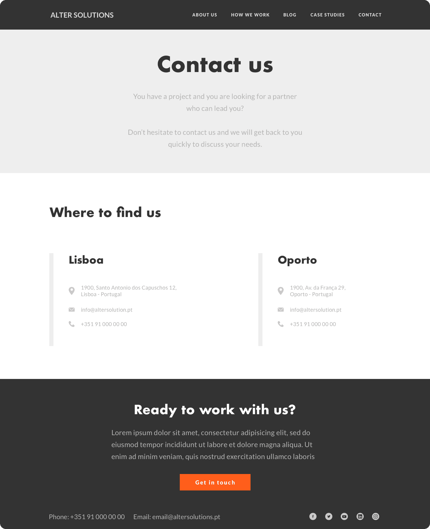
Most competitors lived on a single long scroll. Splitting content across real pages let each section breathe and made the site easier to navigate.
This is where I learned what a full design process actually feels like in practice. I worked it in five phases, the same ones I documented at the time: reference, UX, two passes of UI, and code, each feeding the next, with a tutor and a client pushing back along the way.
01 - REFERENCE
Studying a field I didn't know
Competitor analysis
Pattern mapping
Opportunity spotting
02- ux
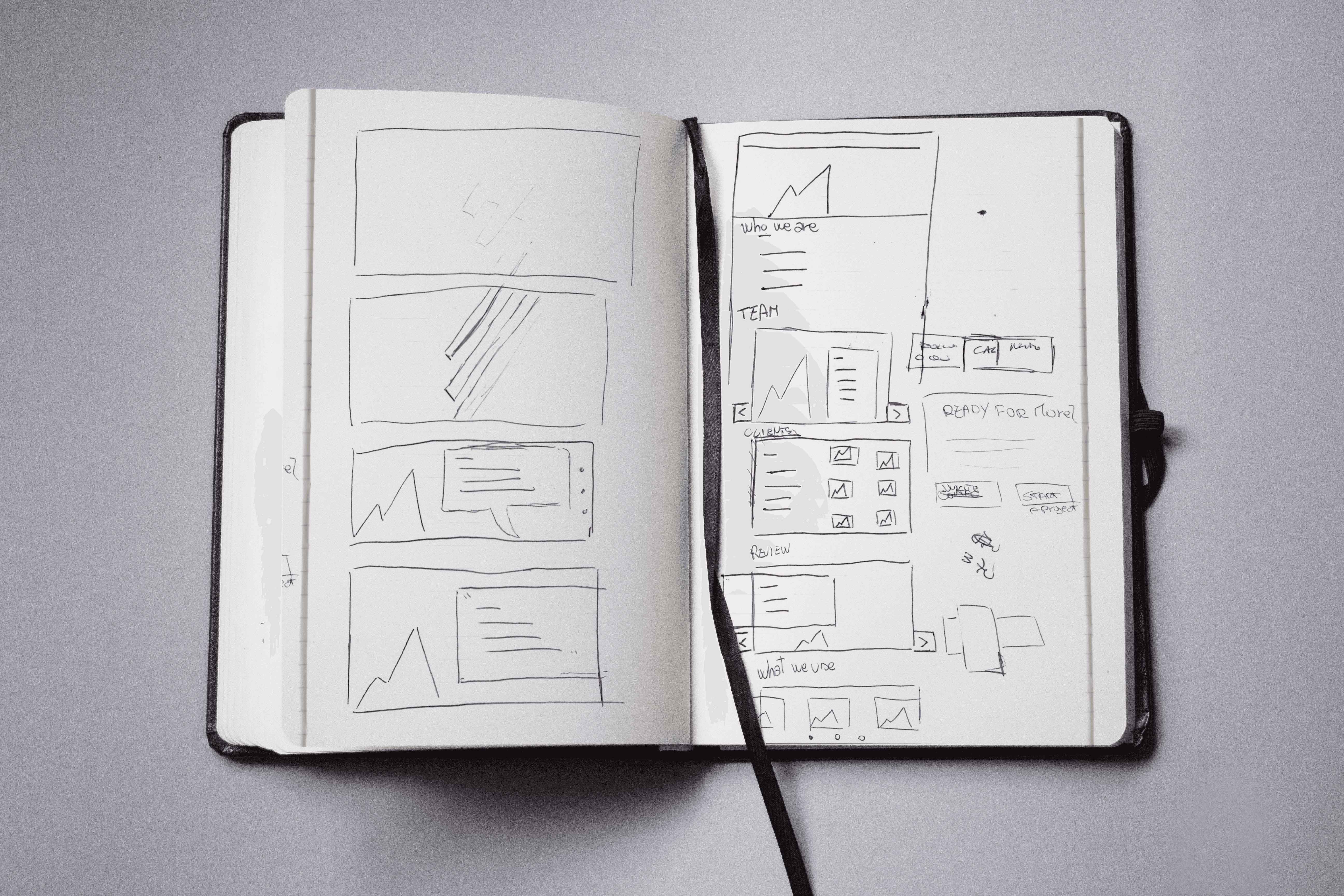
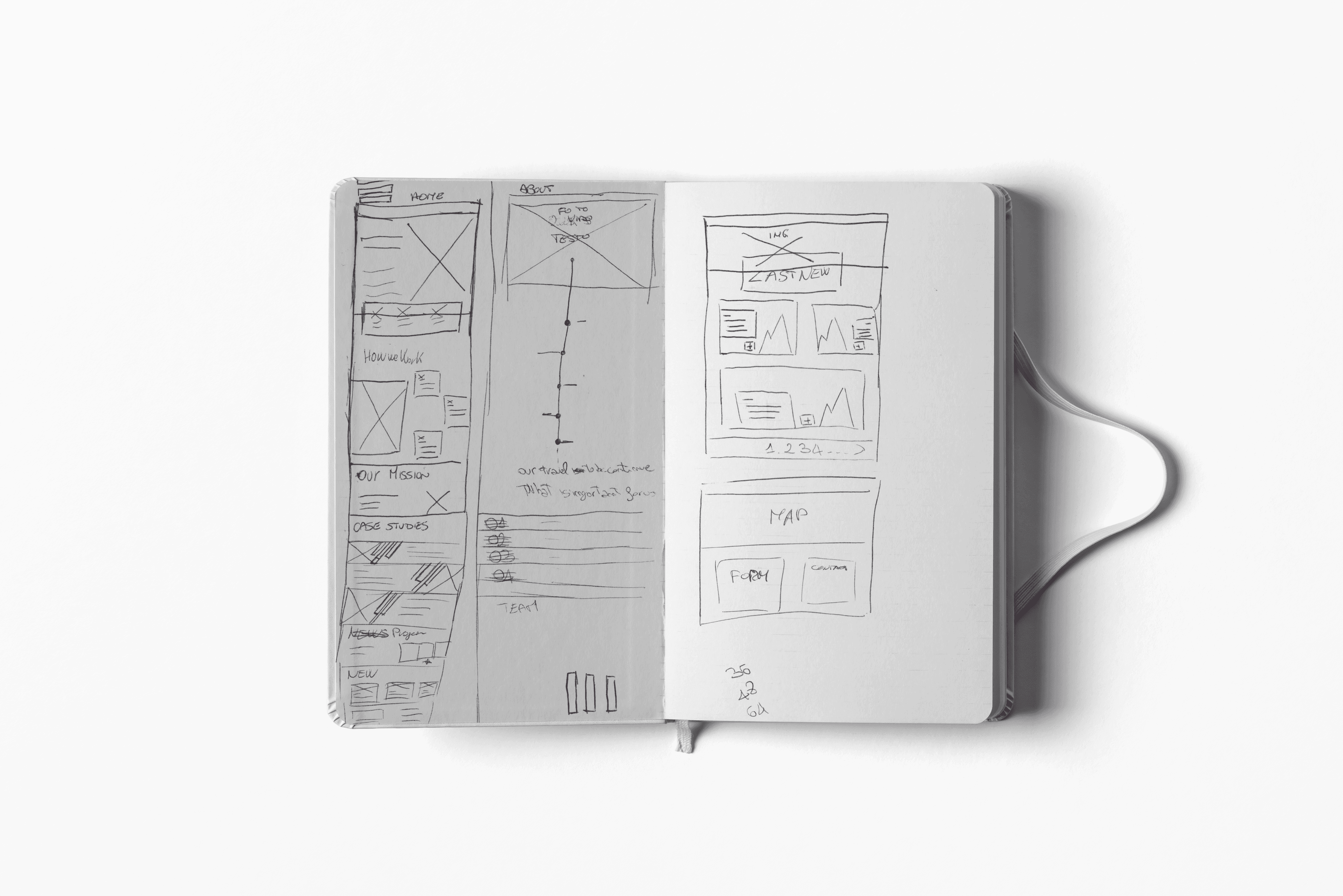
From paper sketches to a clickable prototype
Sketching
Sitemap
Wireframing · Sketch
03 - UI - EXPLORE
Exploring directions while the brand was undefined
Trend research
Hero variants
Divergent exploration
Direction chosen
04 - UI - SYSTEM
Committing once the identity landed
Type & color
Gradients
Gradients
Design consistency
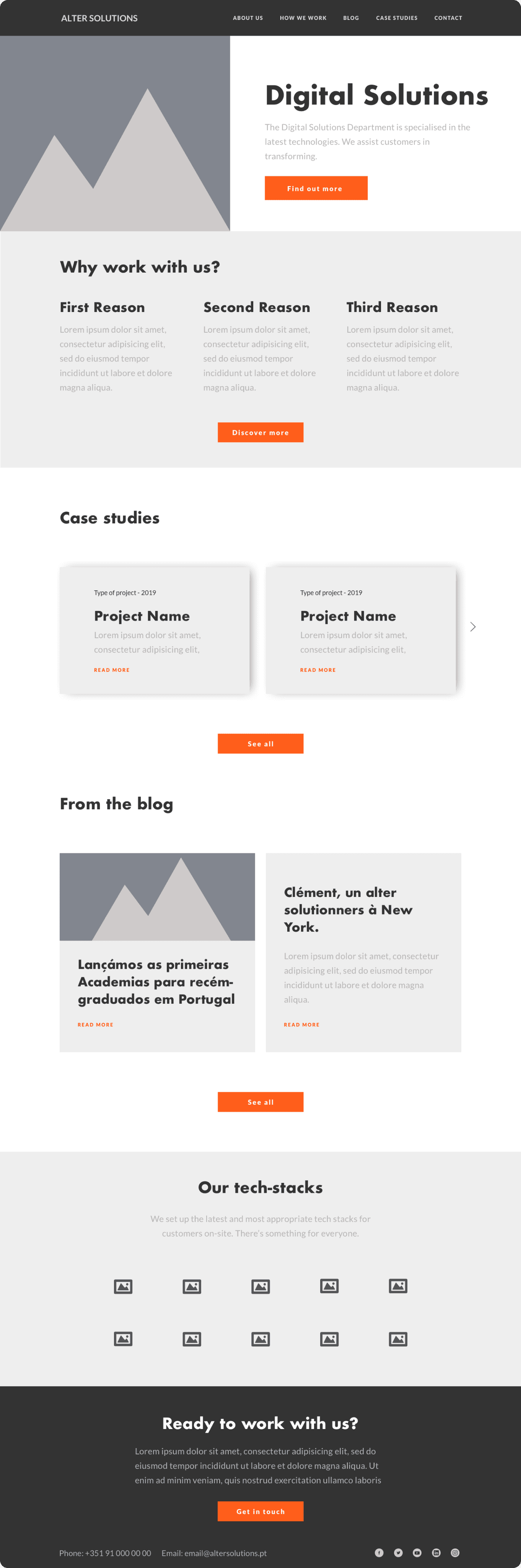
05 - CODING
Shipping the homepage myself
HTML / CSS / JS
Bootstrap
Responsive
Design to code
Five years, one product
Continuous contribution across feature releases and product evolutions, working in tight collaboration with product, development and QA teams.
Five verticals shipped
Features designed and shipped across all five Gazelle verticals (rental, insurance, finance, services and logistics), each with distinct workflows.
A design and dev partnership
Built a structured collaboration model with developers that turned design handoff from a transaction into an ongoing conversation, reducing post release fixes.