Website · UX & Information Architecture
Making a school's full course catalogue easy to navigate
The brief
During my Erasmus at V-A Studio in Lisbon, I worked on the website for ETIC, a school of technology, innovation and creation. I was responsible for the UX: structuring a broad, multi-field course offer into a clear, navigable experience.
The product
ETIC covers fields as different as animation, cinema, computer science, design, photography, fashion and music, each with its own courses, durations and diplomas. The risk was a long, flat list with no clear entry point. The real question wasn't how it looks but how someone finds their way in.
My approach
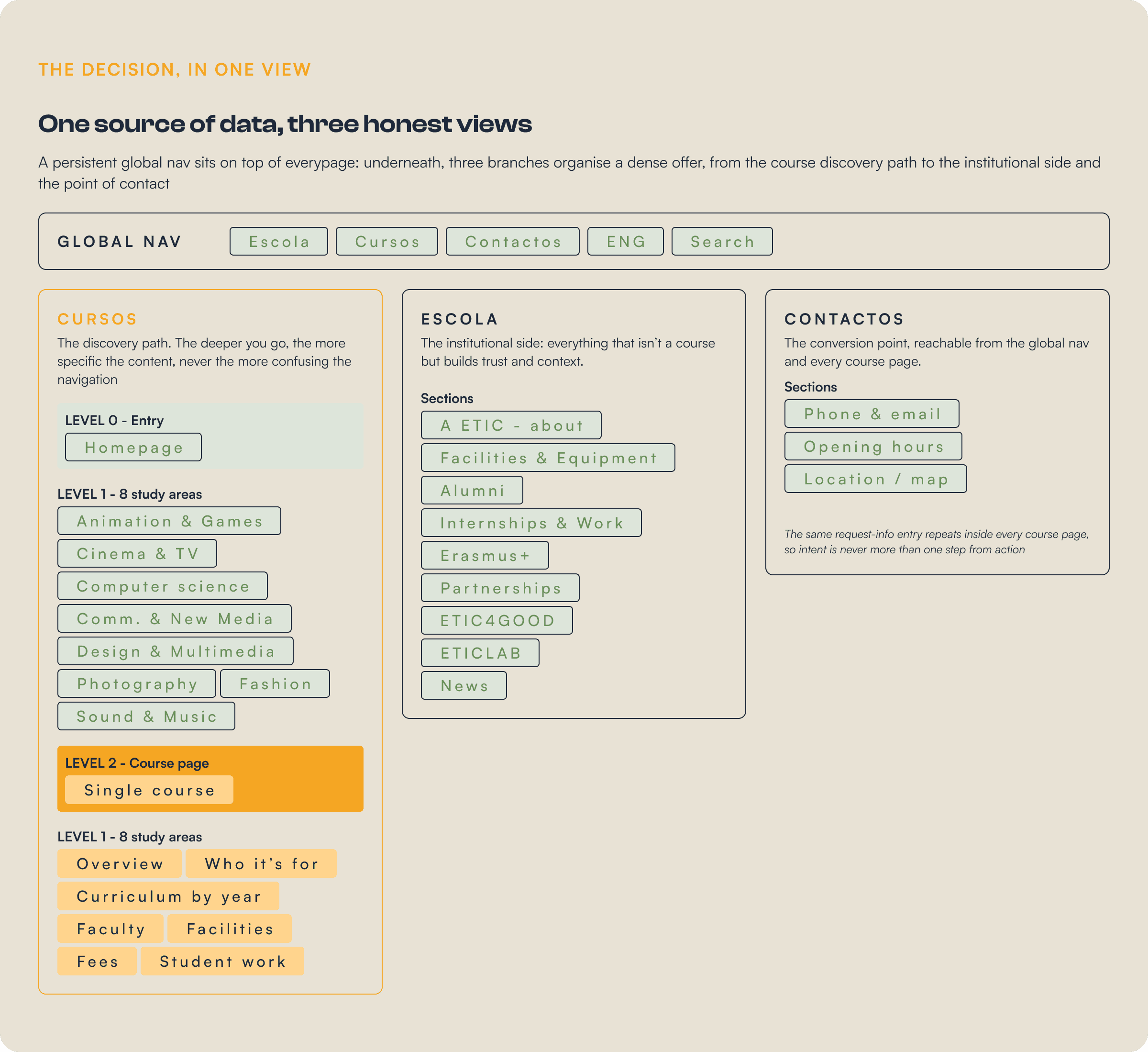
Competitor analysis first, then an information architecture built on two axes: a persistent global navigation and a hierarchical path from broad field to single course. The structure then carried through every section and content type on the site.
my role
I was responsible for the UX and information architecture. The visual identity and final UI were designed by V-A Studio, the screens on this page show how the structure I worked on was brought to life.
Before structuring anything, I studied how comparable schools organised their catalogue: how they grouped programmes, what they put first, and where navigation broke down for someone who didn't already know what they wanted. The recurring failure was the same one ETIC risked, courses dumped in one undifferentiated list.
The catalogue needed a backbone. The structure I worked on pairs a persistent global navigation, keeping the main areas one click away from anywhere, with a hierarchical path that lets a visitor drill from a broad field down to a single course, with no dead ends in between.
Process
With the architecture in place, the rest of the work was making sure every step of the journey held together. From the first landing to the request for information, each stage had a single job, and the structure kept the path short and obvious at every point.
01 - entry
surface the offer
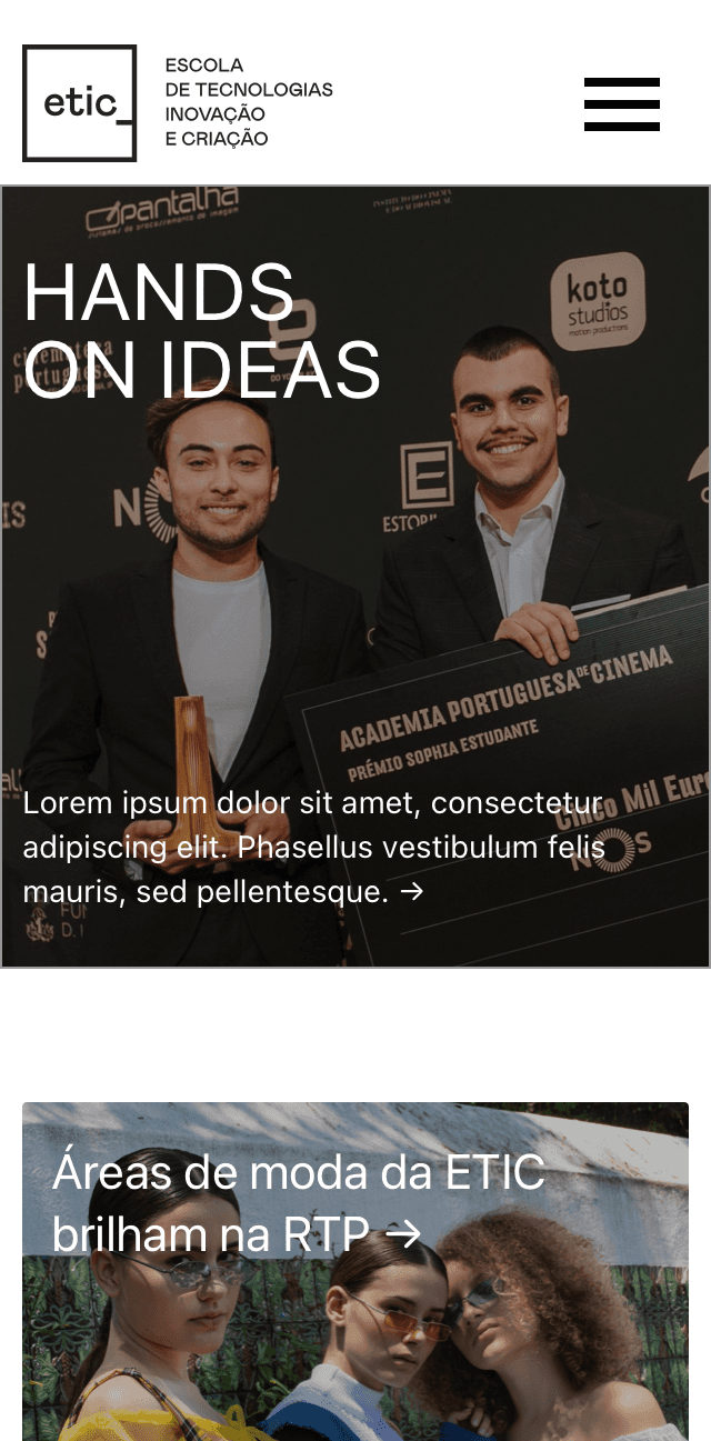
homepage
study areas
02 - NARROW
From area to course
Information architecture
Navigation
03 - DECIDE
A consistent course template
Template design
Content modelling
04 - ACT
Close the loop
Conversion
Responsive
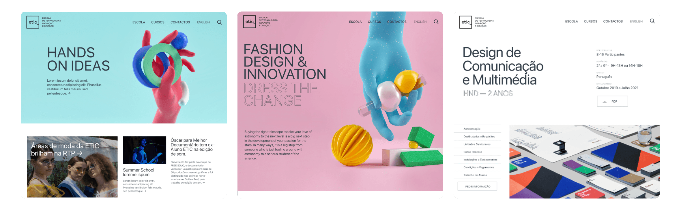
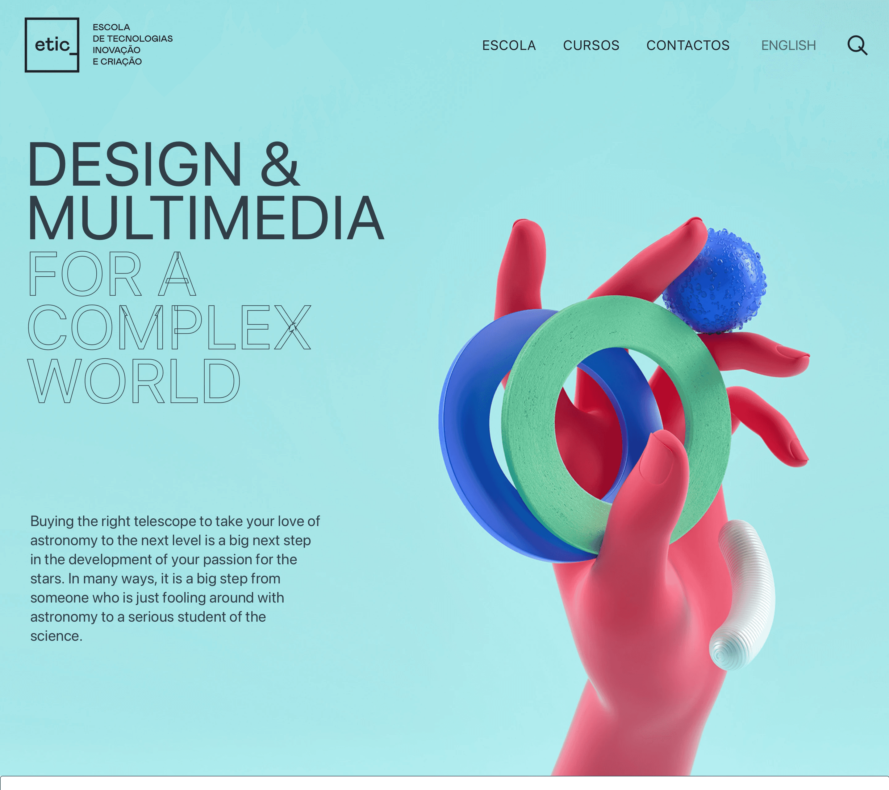
Study area - Design & Multimedia • the field introduced, then its courses. UI by V-A Studio.
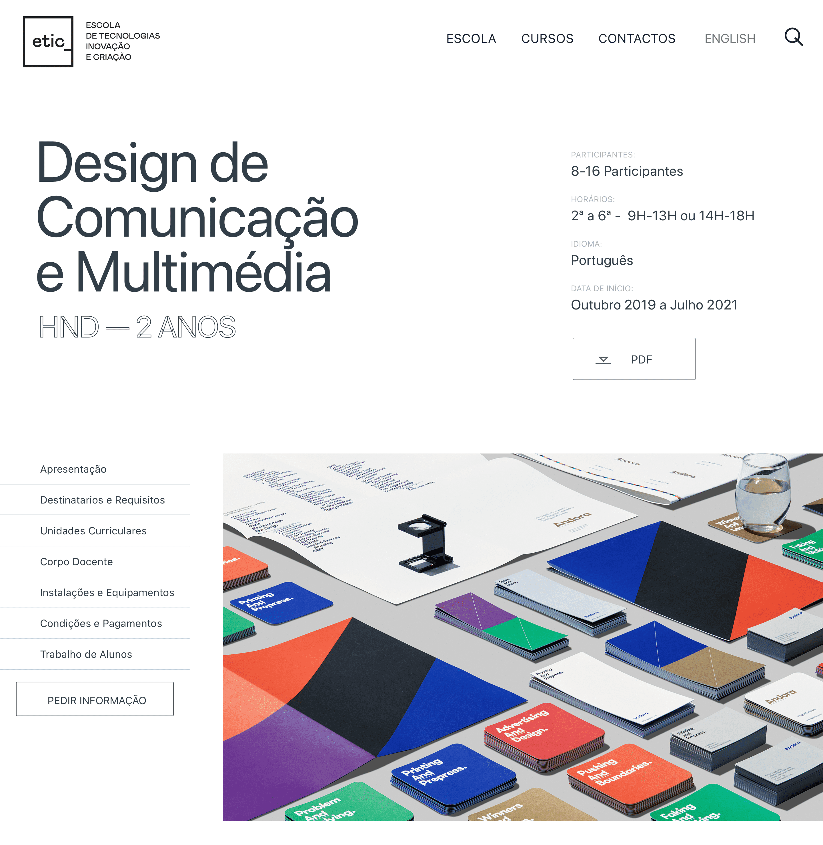
Course page• side navigation, structured meta, curriculum by year. UI by V-A Studio.
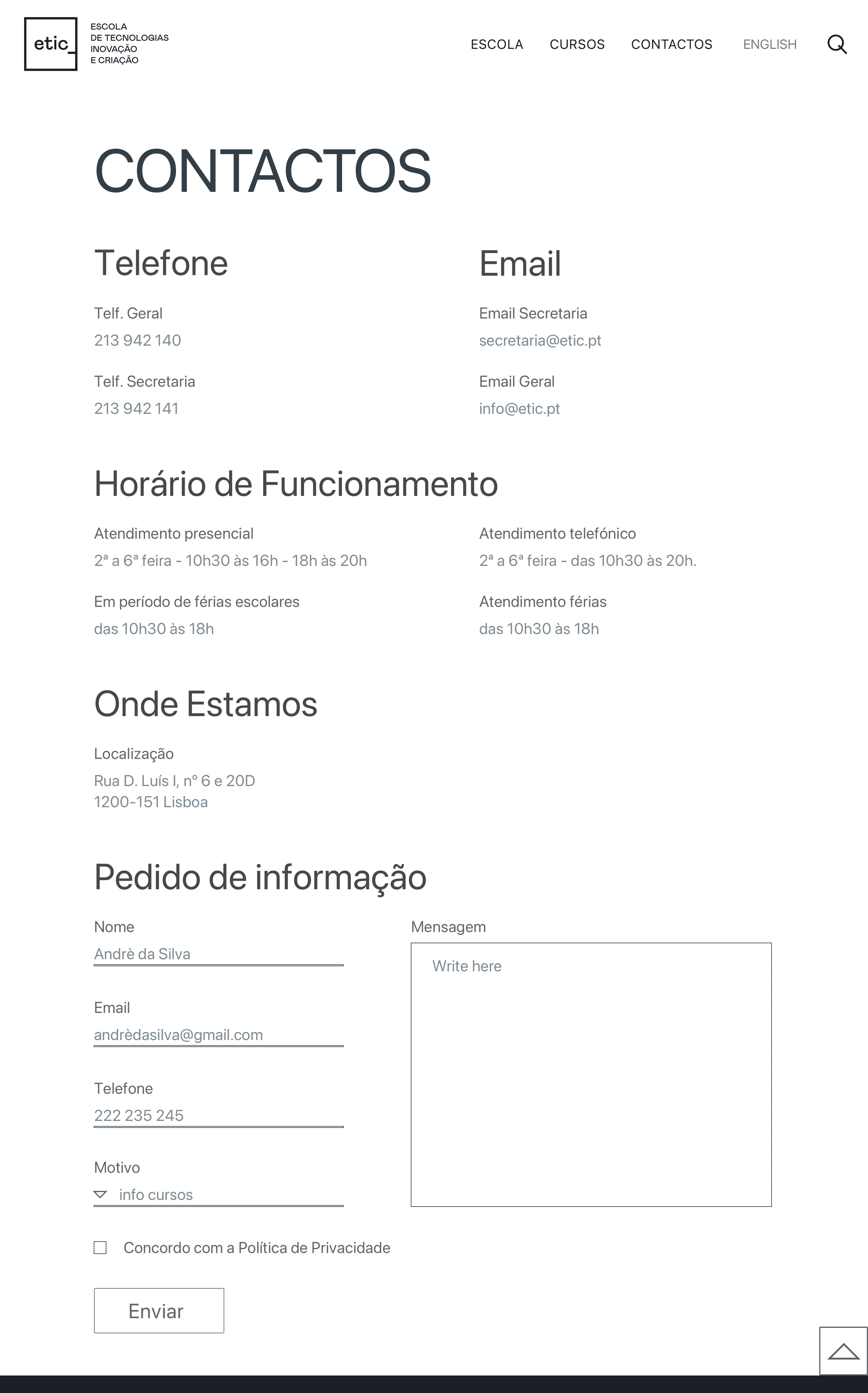
Contact & mobile • the same structure holding together across the request-info flow and on smaller screens. UI by V-A Studio.
What I'd carry forward
Validate the grouping with real students.
The eight areas made sense to us; the next step would be testing whether prospective students group the fields the same way, with a quick card sort.
Pressure-test the course template.
One template across very different programmes is efficient, but I'd check the edge cases, the shortest and the most complex courses, to make sure none feels cramped or padded.
Measure the path to request-info.
The whole structure points toward the request-info form. With analytics in place, I'd track how many steps it actually takes and where people drop off.