Brand identity
Ridifi
A glitch-cut mark for a music and theatre service

The brief
Ridifi was my second independent project, developed together with two fellow graphic designers for a service in the music and theatre industry.
I worked as art director on the project, setting the visual direction, while also getting hands-on with the design work alongside the team.
The goal was a full brand identity: a logo, a colour system and a typographic voice that felt at home on a stage, energetic, contemporary and unmistakably its own.
The result is a compact but complete identity, built to work everywhere from an app icon to a large-format print.
The mark
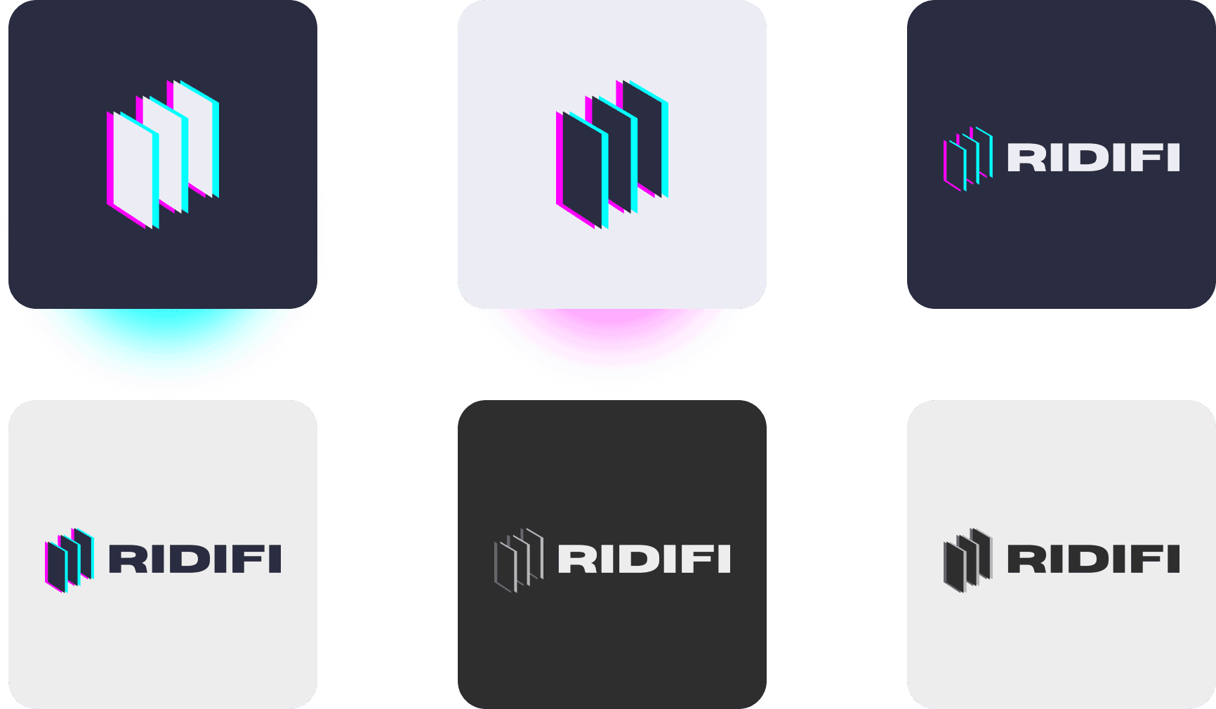
The symbol is built from staggered vertical bars, a nod to the wings of a theatre stage, the curtains you glimpse from the side. A cyan-and-magenta glitch offset gives them movement and a digital, almost electric edge, tying the theatre reference to the music side of the brand.



The system
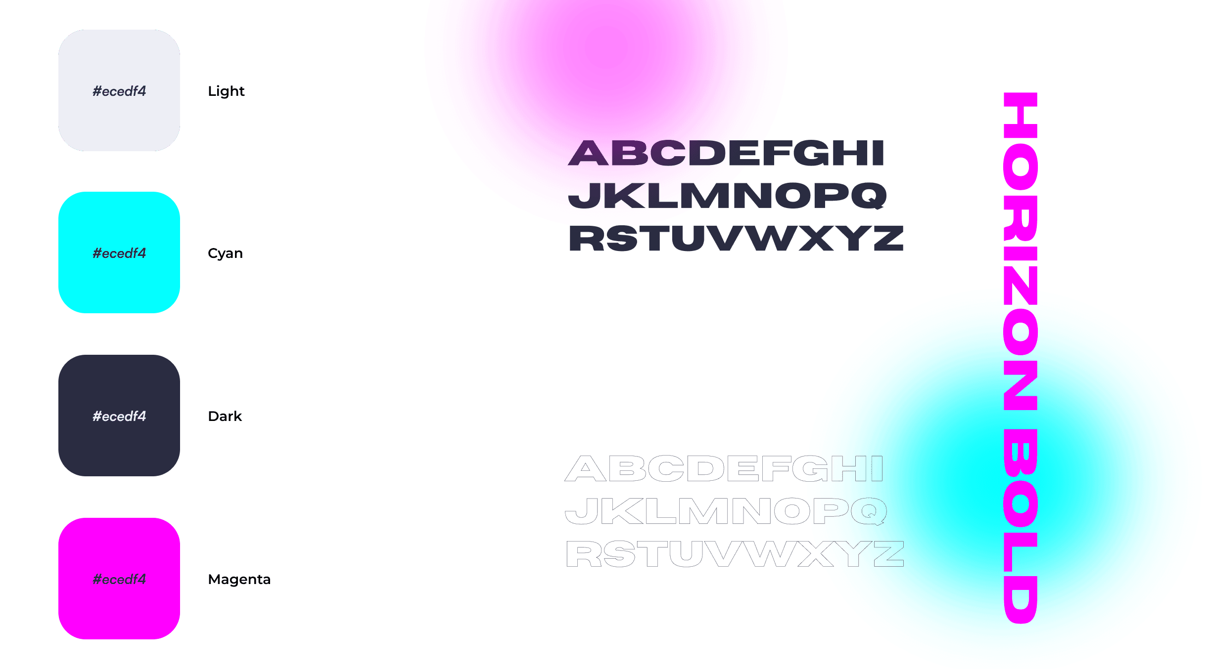
A tight palette and one confident typeface keep the identity sharp and consistent.
In use
The mark holds up across contexts: app icon, monochrome and reversed versions, and on light or dark backgrounds.